Many new designers encounter the same problem when working on corporate websites: the pages look beautiful and the client is satisfied, but after launch, even with healthy traffic, very few visitors submit their details, click the contact options, or visit important pages. In other words, attractive does not necessarily mean effective. A corporate website must do more than look good—it must motivate users to act.
At 58UI, we have developed several design-focused methods for improving website conversion rates step by step. The goal is not to rely on tricks, but to refine the details until users genuinely want to click.
1. Reduce the Effort Required to Understand the Site and Make Your Core Value Visible at a Glance
-
Simplify the homepage and key screens first. Present only the most important information: who you are, what you do, and what problem you solve for users.
-
Focus each screen or viewport on one primary module. Do not fill a single page section with several unrelated messages.
-
Place a short sentence before each button explaining what will happen after the click. For example, “Learn How to Increase Conversions by 20%” provides stronger direction than “Contact Us.”
2. Buttons Are Not Decoration—They Are Critical Action Triggers
For a button to attract clicks, its color must be noticeable, but the surrounding context matters even more. Button copy should be active and communicate value:
-
“Book a Demo Now” → “See How We Can Improve Your Efficiency”
-
“Contact Us” → “Discuss Your Tailored Solution One-on-One”
Treat buttons as part of the content rather than as purely visual elements. When the wording and surrounding content work together, click-through and conversion rates improve.
3. Page Rhythm and Whitespace: Visual Breathing Room Can Also Drive Conversions
Overcrowded pages are tiring to read and make key information difficult to identify. Whitespace, spacing between modules, and orderly alignment improve readability and comfort:
-
Give content room to breathe so users are not overwhelmed by an entire screen of information.
-
Maintain appropriate spacing between modules, and make each content block clearly explain who helped whom achieve what.
-
Add a concise key sentence to important modules such as case studies and service descriptions—for example, “What problem was solved, and for whom?”—to help users understand the value quickly.
Practical Recommendations: Small Improvements Frequently Used in 58UI Projects
|
Area of Optimization |
Actionable Recommendation |
|---|---|
|
Comprehension effort |
Highlight one or two core values in the first screen; explain the service positioning concisely; combine icons with text |
|
Button copy |
Use value-oriented and action-oriented wording; ensure the content before and after the button supports its purpose |
|
Rhythm and whitespace |
Maintain consistent typography and clear modules; use appropriate whitespace and line spacing; balance the proportions of images and text |
|
Testing and iteration |
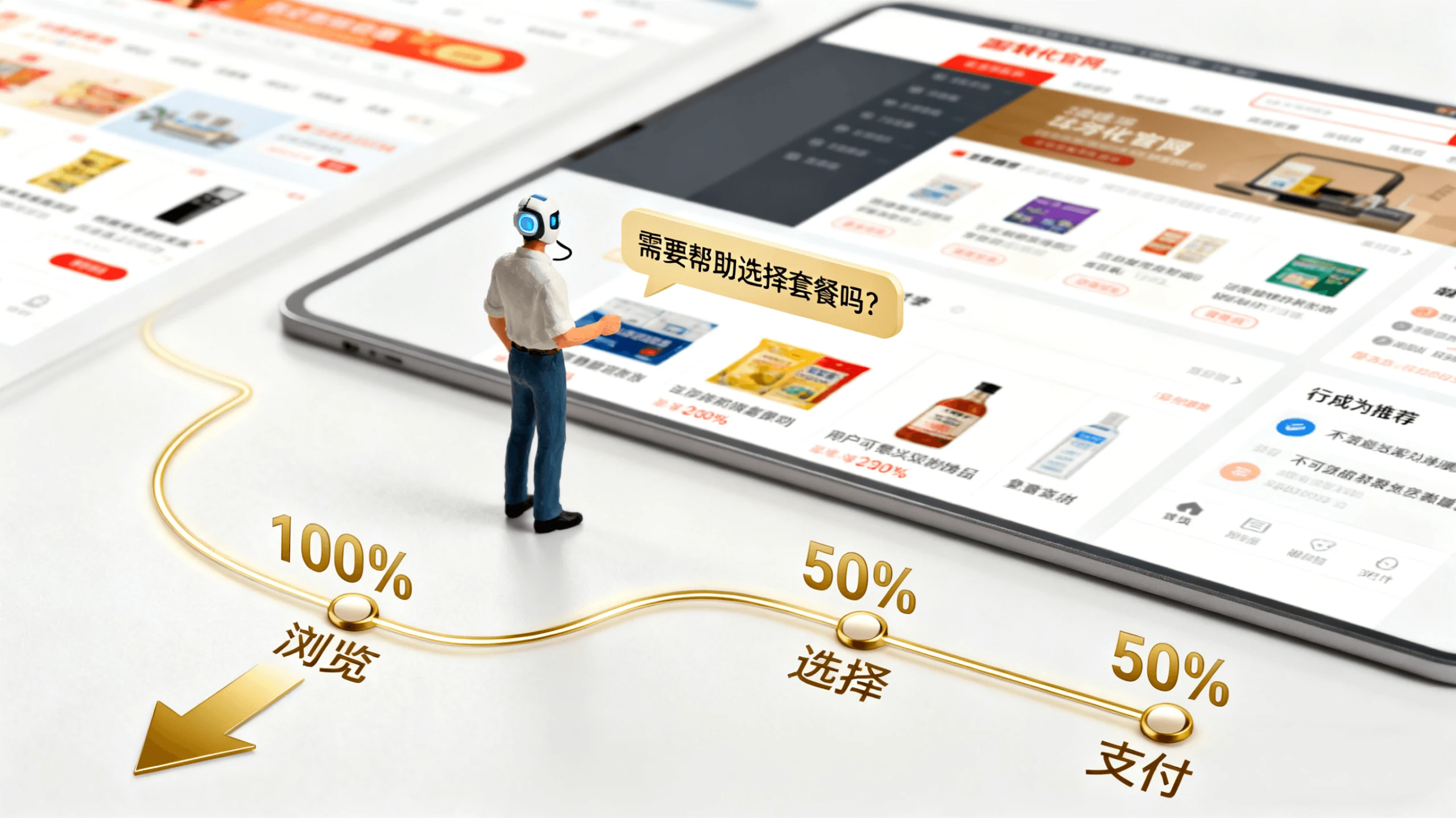
After launch, review visitor click-through rates, time on page, and bounce rates; use the data to adjust button placement and the order of screen content |
Conclusion
Designers do not need to chase a breakout success immediately. Start by mastering the fundamentals of corporate website design: users should understand the content, buttons should invite clicks, and pages should encourage people to keep scrolling. Reduce comprehension effort, connect buttons with persuasive content, and refine page rhythm and whitespace. As these details accumulate, conversion rates will gradually improve.
At 58UI Design Studio, we believe details matter more than flashy effects. Carefully designing every screen, button, and module is the key to turning visitors into customers. If you are preparing a new website or redesign, implement these methods and the results will follow. Contact us to discuss your project, and we can help improve its conversion rate step by step.
Corporate website design, UI/UX conversion-rate optimization, button-copy strategy, page rhythm and whitespace, user-behavior guidance, website design details