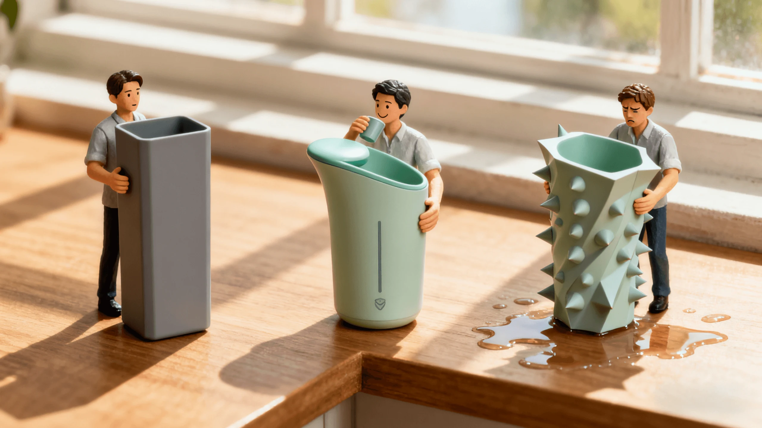
When planning a website project, many clients say: “I want the design to look premium and impressive, while remaining simple and easy to use so visitors understand it immediately.” Our response is often that visual appeal and practicality are not opposites. When the right details are considered throughout the design process, both can be achieved.
1. Aesthetics Capture Attention; Practicality Makes People Stay
An attractive design can encourage users to click, but even the most beautiful site will lose them if information is difficult to find or interactions are complicated.
We once designed a website for a technology company whose client initially emphasized futuristic visuals, including animated lines, a dark background, and floating modules. These elements looked impressive, but after reviewing the prototype, the client asked: “Why is it so inconvenient to find information about a particular service?”
We then refined the visual rhythm, information hierarchy, fixed entry points, navigation anchors, and typography. After the revision, the client said: “It is visually powerful now, but it also feels effortless to use.”
2. Details Create the Difference: The Least Noticeable Areas Are Often the Most Important
-
Typography must balance style and readability. Slightly larger font sizes and line spacing can make the overall reading experience more comfortable.
-
Buttons must not only look attractive, but also be large enough, positioned logically, and easy to click.
-
The balance between images and text matters. Large images attract attention but can overwhelm information, while dense text quickly becomes tiring. Whitespace and spacing give the page room to breathe.
These adjustments may seem minor, but users notice their effect immediately.
3. Different Projects Require Different Balances Between Beauty and Practicality
The brand and industry influence the design emphasis:
-
Technology, fashion, and creative brands often need stronger visual impact.
-
Medical, educational, and legal websites place greater importance on trust and usability.
Before beginning a collaboration, we often ask: “What do you want users to feel during the first five seconds after opening the website?”
If the desired impression is “professional and trustworthy,” the design should not be dominated by flashy effects. If it is “creative and striking,” usability should be embedded seamlessly beneath the visual experience.
4. Find the Point That Feels Just Right
Creating a design that is both striking and easy to use does not depend on inspiration alone. It comes from a series of small decisions and repeated adjustments. Whether you are designing, choosing a design company, or reviewing work internally, keep asking: “Does this design attract people while also allowing them to use it effortlessly?” If so, you are probably moving toward the right balance.
Conclusion
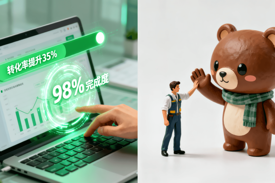
Visual impact can make users pause, but practicality encourages them to continue browsing and convert. As designers and website teams, our goal is to combine brand visuals with user experience so that a website not only looks premium, but also feels comfortable to use.
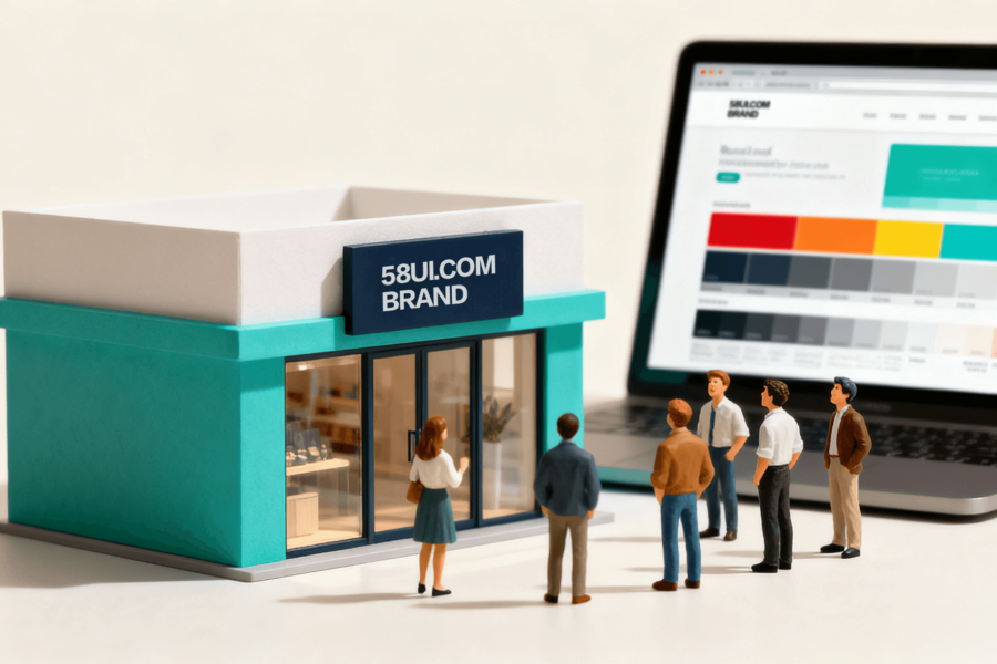
At 58UI Design Studio, every project balances aesthetics and practicality—from visual style and navigation architecture to button dimensions and typographic spacing. We use detail to build quality. If you are struggling with “good-looking versus easy-to-use,” contact us to discuss your project and find the right balance together.
Brand visual design, user experience and UX optimization, interface design and usability, website design details, navigation experience, design balance, visual appeal