In many product designs, motion is often understood as something that “makes the interface look better.”
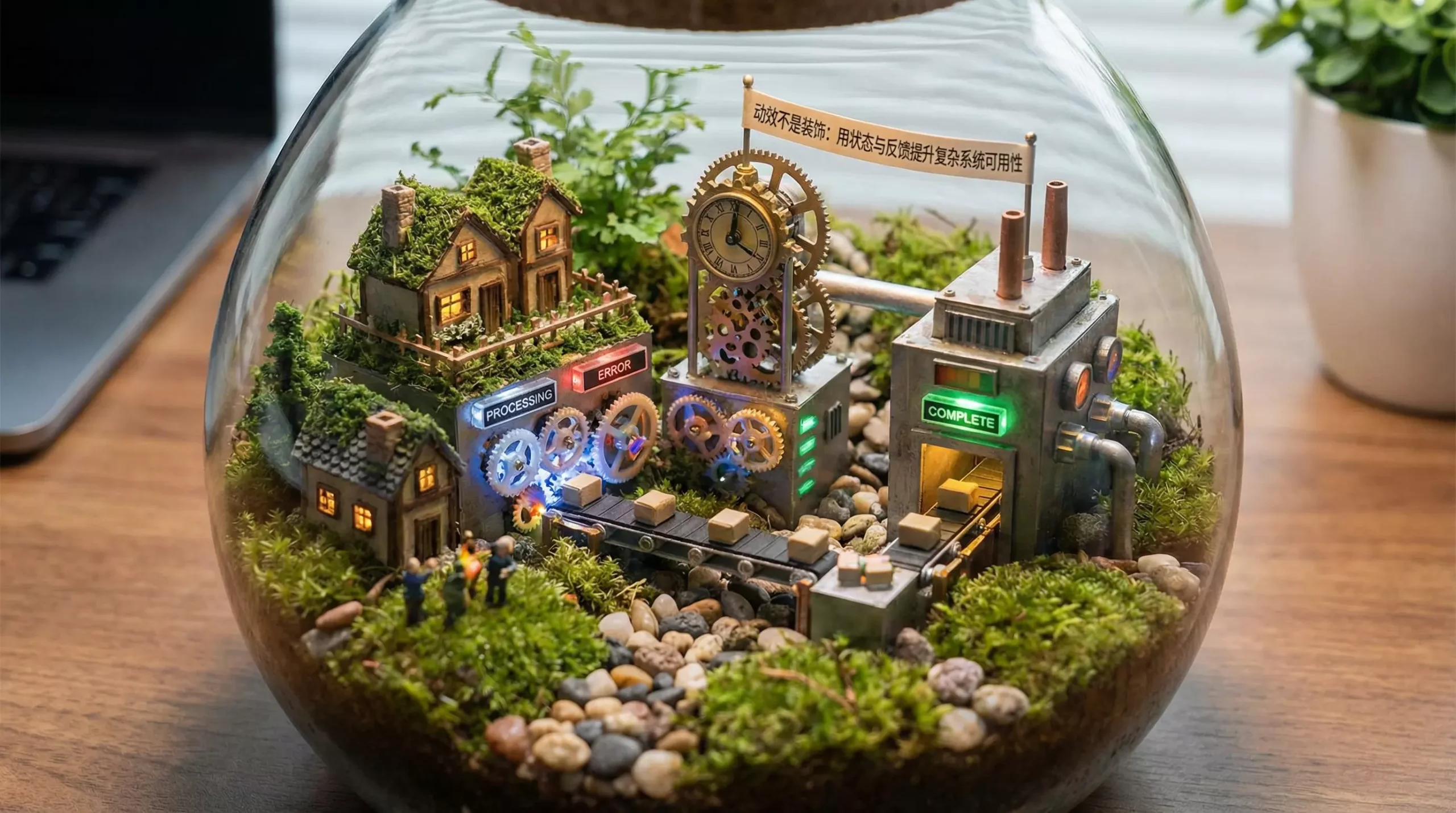
But in genuinely complex product systems, the core value of motion has never been aesthetics; it is communication and the expression of state.
In UI/UX design—especially in administrative systems, productivity tools, financial products, and data-intensive products—the user’s greatest problem is usually not an unattractive interface, but this:
👉 They are unsure what the system is currently doing.
This is where motion reveals its real value.
I. The Essence of Motion: Reducing System Uncertainty
When users operate a system, the situation most likely to create anxiety is “no feedback.”
For example:
-
Nothing appears to happen after a click
-
It is unclear whether an action succeeded
-
Page changes occur without transitions
All of these problems are fundamentally examples of invisible state.
The central task of motion is to solve this problem:
👉 Make the system’s state visible.
II. Three Core Functions of Motion in the User Experience
1. State Feedback: Tell Users That the System Is Working
When users trigger an action—clicking, submitting, or loading—the system should respond clearly through:
-
Loading animations
-
Button-feedback animations
-
Page transitions
These brief animations communicate one message effectively: 👉 “The system has received your action and is processing it.”
This significantly reduces anxiety and prevents repeated actions.
2. Attention Guidance: Prevent Users from Becoming Lost
In a complex interface, users can easily lose sight of what matters.
Motion can:
-
Emphasize critical action paths
-
Guide the movement of the eye
-
Suggest the user’s next action
Examples include subtle movement, gradient highlighting, and guided animations.
Fundamentally, all of them serve one purpose: 👉 help users understand where to look and what to do.
3. Outcome Feedback: Clearly Communicate Success and Failure
Many systems suffer from problems such as:
-
Success feedback that is too weak
-
Error feedback that is too complicated
-
Results that users cannot understand quickly
Appropriate motion can make feedback:
-
For success: concise, explicit, and immediate
-
For errors: clear, recognizable, and not excessively disruptive
👉 Do not use complex, lengthy, or endlessly looping animations.
👉 Users only need to understand the result; they do not need to be distracted by animation.
III. Why Does So Much Motion Look Premium but Feel Difficult to Use?
The most common problems fall into two categories:
1. Overdesigned Motion
-
Every element moves
-
Animations last too long
-
The animation is complicated but meaningless
The result is: 👉 Users’ attention is disrupted, making the interface harder to understand.
2. Inconsistent Rhythm
-
Different animations run at inconsistent speeds
-
Page responses feel unstable
-
Motion is not synchronized with the action
This creates the following experience: 👉 Users cannot tell whether the system is lagging or has encountered an error.
IV. Five Methods for High-Quality Motion Design
1. Clarify the User and the State
Before designing motion, answer these questions:
-
What is the user doing?
-
What state is the system currently in?
-
What information matters most to the user?
Motion must serve these questions rather than decorate the interface.
2. Establish a Consistent Motion Rhythm
Use a consistent timing system, for example:
-
200 ms: micro-interactions such as buttons and hover states
-
400 ms: state changes such as dialogs and switching
-
800 ms: page-level transitions
👉 A consistent rhythm is essential to a stable system experience.
3. Provide a Reduced-Motion Option
For some users, including people with motion sensitivity, excessive animation creates a burden.
Consider providing:
-
A reduced-motion mode
-
Simplified transition effects
This is also an important part of accessibility in modern UI/UX design.
4. Componentize Motion Within the Design System
Strong motion should not be designed as a series of isolated effects. It should become part of the design system:
-
Define motion as a component specification
-
Align it with Design Tokens such as durations and easing curves
-
Make it reusable and extensible
👉 This is one of the core capabilities of a UI design company working on complex projects.
5. Collaborate with Development During Implementation
Motion design must account for:
-
Frontend performance
-
Device compatibility
-
Implementation cost
Otherwise, even excellent motion remains only “an ideal in the design file.”
V. The Relationship Between Motion and the Design System
In a mature product, motion is no longer merely part of the “visual layer.” It is:
👉 Part of the system layer.
It must align with:
-
The component system
-
Interaction logic
-
State management
-
The user-experience strategy
This is why a professional UI design company or UI/UX design team incorporates motion into the overall design system instead of handling it separately.
VI. Conclusion
Motion is neither decoration nor technical showmanship.
Its real purpose consists of only three things:
-
Tell users that the system is changing
-
Tell users that the change is complete
-
Tell users what to do next
When motion accomplishes these three goals, it truly becomes: 👉 a tool that improves the user experience rather than a visual burden.
In complex systems, excellent motion design often determines whether a product feels usable.
That is also one of the most fundamental differences between professional UI/UX design and ordinary interface design.