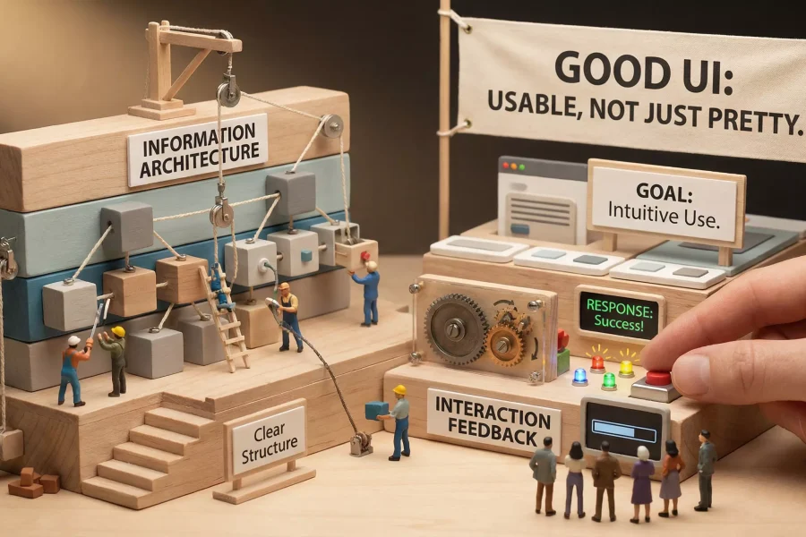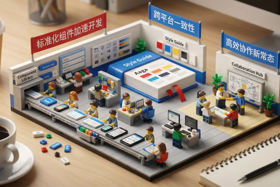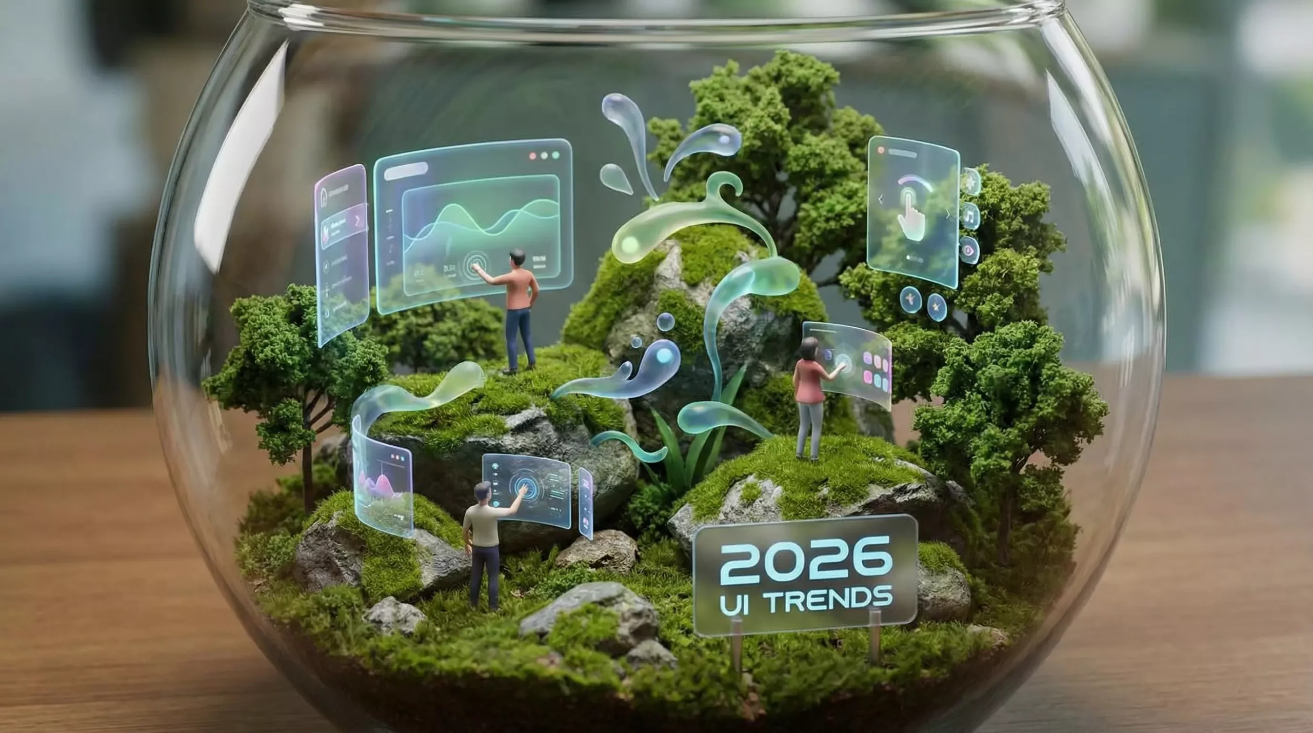
Every year the design industry produces new buzzwords: neumorphism, glassmorphism, the return of skeuomorphism, anti-system brutalism, revived gradients, and more. But a team that chases style alone will become outdated quickly. The more important shift in 2026 is that user attention is becoming even more fragmented, product ecosystems are more hybrid—web, apps, mini programs, and large screens—and information density continues to grow, while people still expect interfaces to feel clearer, easier, and faster. I therefore divide the trends into four underlying principles: minimalist noise reduction, 3D storytelling, explanatory motion, and AI collaboration.
1. Minimalist Noise Reduction: Not a Cold Aesthetic, but Greater Efficiency and Readability. “Minimalism” is not about making an interface look empty. It is about reducing cognitive load. More products are abandoning complex backgrounds and heavy decoration in favor of:
-
Generous whitespace and clear grids that give information the rhythm of a newspaper
-
High-contrast headings and lower-contrast body text that make priorities immediately visible
-
Fewer colors and more grayscale to reduce visual noise
-
Consistent button styles and shadow levels that establish a stable visual language. This approach may seem unexciting, but it is highly durable because it serves reading and decision-making efficiency.
2. Stronger 3D Storytelling: 3D Is No Longer a Gimmick, but a Narrative Tool. In the past, 3D graphics were often used simply to attract attention. A more appropriate use today is communicating structure and relationships. For example:
-
Use 3D icons to explain concepts and make them feel less abstract
-
Use 3D scenes to visualize product processes and show how data moves
-
Use 3D interface cards on SaaS landing pages to explain functional modules. The key principle is that 3D must serve the information rather than dominate it. If it slows loading or distracts users, it has failed.
3. Motion That Explains State: Animation Should Improve Understanding. In 2026, expect more state-based animation rather than showpiece effects:
-
Loading animation that communicates that the system is working
-
Error feedback with subtle motion that helps users locate the problem
-
Progressive transitions for data changes that prevent abrupt flashing
-
3D lift on card hover to communicate clickability. Good motion follows physical and hierarchical logic faithfully, helping users understand what the system is doing and whether their action succeeded.
4. AI Collaboration: Designers Become Process Designers and System Builders. AI is not replacing designers. It is freeing them from repetitive work so they can focus on higher-level responsibilities:
-
AI-generated first drafts for rapidly exploring many alternatives
-
AI-assisted copywriting for consistent tone and less empty language
-
AI-generated icon and illustration sketches for brainstorming
-
AI-assisted componentization that turns recurring layouts into systems. The designer’s value is moving upward from individual pages to systems, processes, strategy, and validation. People who use AI effectively do not treat it merely as a drawing tool, but as a collaborative partner.
5. Accessibility and Performance Budgets Become Essential. Behind the popularity of minimalism is also pressure to improve performance. More teams are treating performance as part of the design brief:
-
Keep first-screen assets within budget, compress images, and reduce scripts
-
Use sufficient contrast, visible focus states, and clear form-error feedback
-
Ensure the same component behaves consistently across devices. Users will not sacrifice time or battery life for your visuals. Performance and accessibility increasingly determine whether they stay.
Conclusion. The UI trends of 2026 are not a particular visual style, but a durable capability: building stable systems amid change and delivering clarity, speed, and predictability beyond visual spectacle. In an era of minimalism, 3D, motion, and AI collaboration, the boundaries of design are expanding. Your job is no longer simply to draw interfaces, but to make information easier to understand, decisions easier to make, and experiences more stable.