
Typography is a peculiar skill—too mathematical to be called pure art, yet too abstract to be called pure science.
Modern life is saturated with text, so every frontend developer needs a thorough understanding of the art of typography.
Let us review the most common typographic mistakes and how to avoid them.
Key Takeaways
-
Misjudging line length harms readability. The optimal line is roughly 50–60 characters; lines that are too long or too short both create strain and distraction.
-
Careful tracking—the space between letters—is essential to reading flow. Tight tracking reduces reading speed, while expanded tracking has a significant negative effect only when spaces exceed approximately one letter width.
-
Pairing typefaces requires careful judgment to achieve both harmony and contrast. There is no fixed formula, but a common combination uses a decorative serif for headings and a sans serif for body text to improve screen legibility.
-
Poor color choices can severely damage the reading experience. Avoid tones that are too similar, as well as combinations such as green and red or white and yellow. Aim for contrast that is neither excessively strong nor too weak.
Misjudged Line Length
Many designers pay too little attention to the average number of characters per line, negatively affecting readability.
Fortunately, this mistake is easy to avoid because an optimal range has already been established.
The influential Swiss typographer Emil Ruder studied the subject extensively during the 1950s.
In his pioneering book Typography: A Manual of Design, he concluded that the “sweet spot” for line length is approximately 50 or 60 characters.
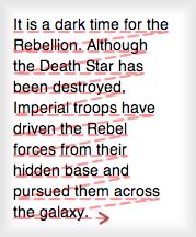
Shorter lines
slow comprehension because
the eye must spend more time
locating the next
line.
His tests found that when reading long passages spread horizontally, readers struggled to track from the end of one line to the beginning of the next. They often had to reread the previous line to ensure they had found the correct continuation.
Short lines, on the other hand, force the eyes to spend more time moving downward and to the right in search of the next line.
In either case, poor line length causes strain, distraction, and reduced comprehension and retention.
In responsive design, of course, line length is no longer a single static value.
Fluid layouts require you to think of line length as a range between breakpoints rather than one exact number. I recommend maintaining a minimum above 45 characters and a maximum below 80.
Tracking: The Middle Ground
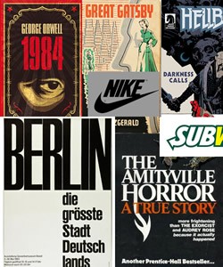
Logos, headings, book covers, and other
large text commonly use
tighter spacing than body copy can tolerate.
Designers sometimes pay insufficient attention to spacing between letters, technically known as tracking. Letter spacing is a critical factor in reading fluency.
This can be difficult because logos, headings, and book covers often reduce tracking to create internal cohesion. They may even use negative tracking to force characters to overlap, as in the old eBay logo.
As several well-known examples demonstrate, the result can look excellent.
Applying the same approach to body copy, however, is almost always a mistake.
A 2006 research team at the University of the Pacific found that even a slight reduction in default letter spacing immediately reduced reading speed. Interestingly, gradually increasing the spacing above the default produced a significant effect only after it exceeded approximately one letter width.
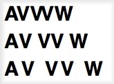
Letter spacing set to -4px, the default value, and +4px.
If you want to confirm that the tracking is correct, use two simple tests.
Check that “AV” is easy to read and that “w” can be distinguished clearly from “vv.”
On the web, tracking is controlled with the CSS letter-spacing property.
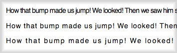
Reduced tracking quickly damages the clarity of body text.
The property is well supported by browsers, although the commonly used em unit has historically been less reliable than ordinary pixels.
Source: University of the Pacific PDF, The Effect of Character Spacing on Text Legibility
Poor Typeface Pairing

Photo: ejorpin
Not long ago—before the rise of web fonts—it was much harder to make this mistake.
Only a few years ago, choosing web fonts was like choosing a school uniform. With so few system fonts available, no one could create anything extraordinary, but few people produced anything truly terrible either.
Easy access to enormous numbers of new typefaces creates opportunities for excellent work—but also many new ways to make poor choices.
The first point to understand is that no fixed formula determines a successful type pairing. There are only guidelines.
Remember that harmony is probably the objective, but it can be achieved with strongly contrasting typefaces.
By contrast, I mean finding typefaces that are different while still complementing one another. This is difficult but can produce distinctive and excellent results.

David Curcurito’s cover design for Esquire
breaks almost every rule of layout and typography.
David Curcurito’s Esquire covers are famous for disregarding traditional ideas about whitespace, consistency, and even legibility—yet they performed exceptionally well on newsstands.
This means you do not need to avoid combining bold and ultra-light weights or placing large type beside small type. Contrast can be productive.
In such cases, you should certainly consider the relationship between serif and sans-serif typefaces.
A common combination uses a decorative serif for headings and a sans serif for body copy, where it generally provides greater legibility, particularly on screens.
As Esquire demonstrates, designers are rarely restricted to a single pair of typefaces. My advice is to experiment with several combinations before making a final decision.
Only then can you identify the result that best meets the project’s needs.
Inappropriate Typeface Selection
With so many typefaces available, selecting the right one for a project is not always easy.
Designers often fall in love with an impressive new typeface and immediately search for opportunities to use it everywhere. Most of us have probably done this.
Consider the following example:
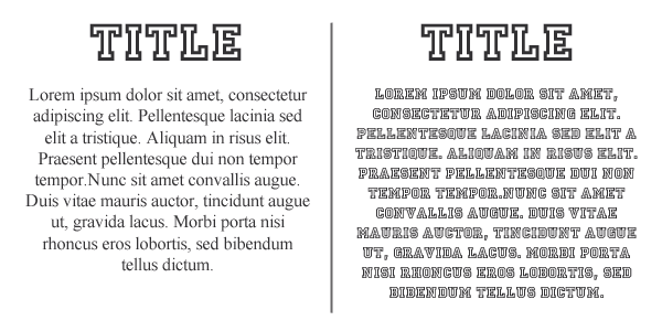
Unfortunately, this is an example of a good typeface becoming bad through inappropriate use. The decorative face that looks excellent in the heading appears extremely awkward in the body copy.
In the second case, readability suffers, and readers may simply ignore the paragraph because understanding it requires too much effort.
For body text, choose a straightforward, classic, and highly readable typeface.
Another common mistake is choosing a font without considering the original purpose of the writing.
Typefaces communicate differently in different contexts.
Serif fonts, for example, can convey authority and often suit formal materials such as legal documents, résumés, or academic papers.
For friendlier and more informal writing, a sans serif or a bold, highly rounded typeface may be more appropriate.
Poor Color Combinations
The relationship between background and text color is another major factor in readability.
A common mistake is choosing two tones that are so similar that words become difficult to distinguish from their surroundings. This is annoying for most users and can make content almost unusable for people with visual impairments.
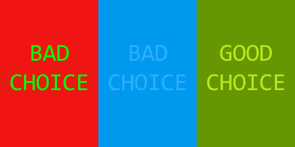
Some combinations also produce harsh and unpleasant effects. Green and red, or white and yellow, should not be used together.
When selecting two or more colors, aim for appropriate contrast—neither excessive nor insufficient.
Leading
“Leading” is the vertical distance between two consecutive lines of text. It is pronounced “ledding,” not “leeding.”
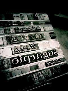
Photo: jcolman
The term comes from the strips of lead traditionally used by letterpress printers to separate lines of type.
Many designers fail to give leading sufficient attention. Descenders from one line can then overlap ascenders on the next. Excessive leading produces the opposite problem, making text feel disconnected and difficult to follow.
A useful starting point is approximately 140% of the font size.
For example, if the type size is 20pt, an appropriate line height is roughly 26–28pt.
Remember that serif typefaces generally require more leading than sans serifs, while heavy block forms need more vertical space than lighter type.
That concludes today’s overview. I hope these techniques help you enjoy working with typography.
Frequently Asked Questions About Typography
What is the minimum readable font size in print and digital media?
In print, the minimum readable size is commonly around 6 points, although the exact value depends on the typeface and the reader’s eyesight. For digital media, body text of at least 16 pixels is generally recommended. Screen resolution, device type, and user preference should also be considered.
How should I choose a font when space is extremely limited?
When space is limited, choose a typeface that remains clear at small sizes. Sans-serif fonts are often effective because they generally render more cleanly than serifs at reduced dimensions. Also consider letter and word spacing. Tighter spacing can fit more content into a limited area, but it may reduce readability.
What factors should I consider when selecting font size?
Consider the medium—print or digital—the amount of text, available space, target audience, and overall design aesthetic. Legibility and readability should remain the priority so the text is easy to see and understand.
How does font size affect the overall design?
Font size establishes information hierarchy and directs attention toward the most important elements. Larger type is commonly used for headings and subheadings, while smaller sizes are used for body content.
What is the difference between serif and sans-serif typefaces?
Serif typefaces have small strokes attached to the ends of larger letterforms. They are commonly used in print and often feel more traditional. Sans-serif typefaces omit these strokes and are frequently used in digital media because of their clean, contemporary appearance.
How can typography improve the user experience?
Typography can improve readability and legibility, establish hierarchy and contrast, and communicate a particular mood or tone. Strong typography guides the reader’s eye and makes content more enjoyable to consume.
What role does line spacing play in typography?
Line spacing is critical to the reading experience. Too little makes text crowded and difficult to read; too much makes related content feel disconnected. A useful rule of thumb is approximately 1.5 times the font size.
How does font color affect readability?
Font color has a substantial effect on readability. Text and background should provide sufficient contrast. Dark text on a light background is generally the easiest combination to read.
How important is typeface selection in branding?
Typeface selection is central to branding. It communicates mood and personality and strengthens recognition. Choose fonts that align with the brand identity and target audience.
How can I test whether my typography is readable?
You can conduct user testing by asking people to read the content and provide feedback. Online tools can also analyze typographic settings and identify potential readability problems.