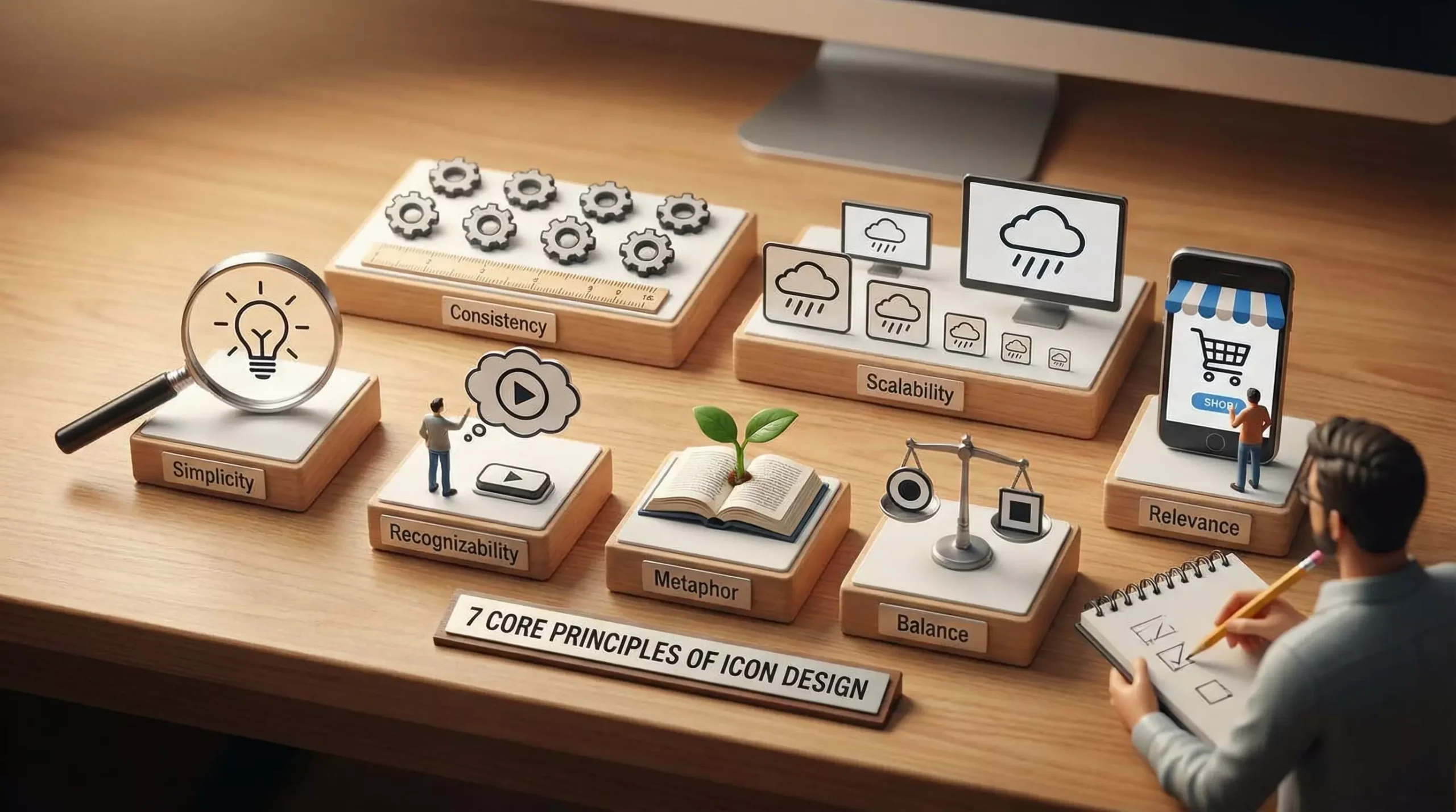
In UI and product design, icons are often underestimated visual elements.
Many people regard icons as supporting details,
but in projects at 58UI Design Studio, we have repeatedly confirmed one fact:
The professionalism of an icon set directly affects how complete and trustworthy an interface feels.
Excellent icon design is never simply a question of whether an icon looks attractive. It is a form of systematic visual engineering.
Icons Are Not Isolated Symbols but a Visual-Language System
A genuinely mature icon set has the following qualities:
-
It is not enough for individual icons to look good.
-
The entire set must remain unified, restrained, and credible when displayed together.
-
It should support a product over the long term rather than serve as a one-time collection of assets.
In other words:
An icon set is a unified visual narrative, not a collage of unrelated graphics.
01 | Begin with a Clear Theme, Not with Drawing Shapes
❌ Common Mistake
-
Draw several attractive icons first,
-
then try to assemble them into a set.
✅ Correct Approach
Before drawing anything, answer three questions:
-
What context will the icon set serve? A product, official website, administration system, or app?
-
Is the theme a broad concept or a highly specialized field?
-
Who will use it: general consumers, professional users, or enterprise users?
Once the theme of an icon set becomes unclear, the work will inevitably lose control later.
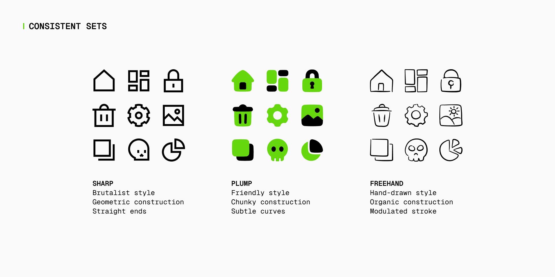
02 | Choose a Style and Commit to It from the Beginning
In icon design, one of the greatest mistakes is allowing the style to shift.
Define the following dimensions at the beginning:
-
Outline or filled
-
Flat or skeuomorphic
-
Geometric or organic
-
Abstract or realistic
-
Minimal or detail-rich
Under the standards used at 58UI Design Studio, once a style is selected, it is never changed halfway through the project. Otherwise, the set will inevitably feel fragmented.
03 | Consistency Is the Lifeline of Icon Design
When an icon “does not look right,” 99% of the time the problem is inconsistency.
Elements that must be standardized include:
-
Stroke weight
-
Corner radius
-
Proportional relationships—top-heavy or bottom-heavy forms can immediately look inexpensive
-
Visual center of gravity
Even a difference of 0.5 pixels in stroke width can become highly visible within an interface.
04 | Visual Hierarchy Must Be Clear—Icons Are Not Illustrations
The primary purpose of an icon is to be recognized quickly.
An excellent icon should:
-
Communicate what it represents at a glance.
-
Remain effective when reduced in size.
-
Keep the primary subject clear while preventing supporting details from competing for attention.
Remember one principle:
An icon is an information tool, not an art exhibition.
05 | Design for Scaling, Not Only for Large Sizes
Real icon use cases include:
-
16 × 16 for systems and tables
-
24 × 24 for toolbars
-
32 × 32 or 48 × 48 for navigation and functional areas
If an icon looks good only at a large size, it is not successful.
A professional process includes:
-
Repeatedly checking the icon at smaller sizes during design.
-
Prioritizing a recognizable silhouette at small sizes.
-
Removing details when necessary rather than allowing them to blur together.
06 | Use a Grid System Instead of Relying on Intuition
Mature icon design is always based on a grid system.
The grid helps:
-
Standardize proportions.
-
Standardize whitespace.
-
Standardize visual weight.
This may initially feel counterintuitive,
but that restraint is what makes icons professional, durable, and resistant to visual aging.
07 | Evaluating the Entire Set Is Always More Important Than Evaluating One Icon
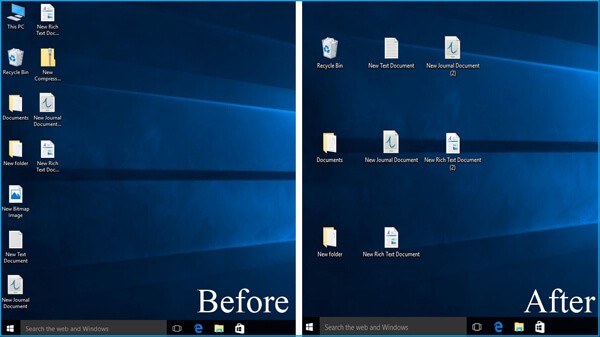
A simple but highly effective review method is to
place every icon on the same canvas and evaluate them together.
If you notice:
-
Several icons stand out too strongly.
-
Several feel childish.
-
Several have an unusual center of gravity.
Then the set is not yet complete.
At 58UI Design Studio, we never approve icons only on an individual basis. Our final delivery standard is the unity of the complete set.
Icon-Design Review Checklist—Worth Saving
Before delivery, check each item:
-
Is the theme singular and clearly defined?
-
Does the style remain consistent throughout?
-
Are stroke weights consistent?
-
Are corner-radius rules consistent?
-
Do the icons remain clear at small sizes?
-
Are they based on the same grid system?
-
Does the entire set feel harmonious when displayed together?
If even one requirement is not met, the work is not truly finished.
Conclusion: Good Icons Disappear into the Experience
Truly excellent icon design has one common characteristic:
Users barely notice the icons themselves.
They feel so natural, logical, and consistent
that they become fully integrated into the interface experience.
From the perspective of 58UI Design Studio,
the ultimate goal of icon design is not to receive compliments,
but to make the entire product feel effortlessly professional.