When designing a website or product, many problems do not come from an incorrect structure,
but from one simple issue:The user does not know what to do next.
In official-website and product-optimization projects at 58UI Design Studio, we have reached one highly consistent conclusion:
👉 The quality of an experience is often determined not by the large-scale structure, but by small micro-interactions that appear insignificant.
Micro-interactions are not technical showmanship. They are a way to help users feel more certain, reassured, and willing to continue.
What Are Micro-Interactions, and Why Do They Matter So Much?
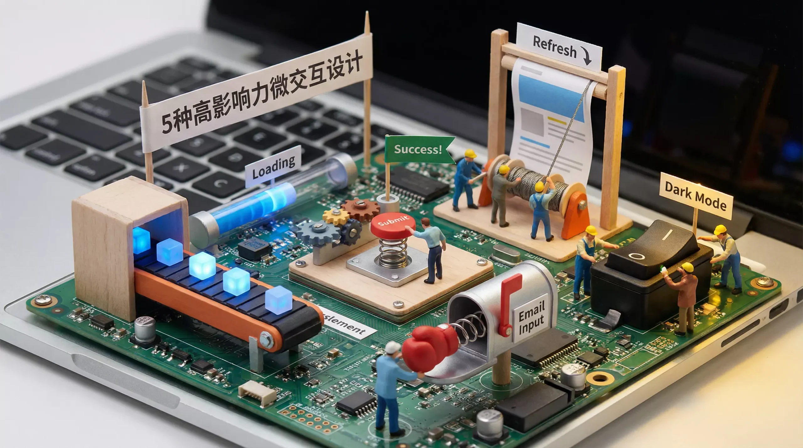
Micro-interactions are the small responses that appear during user actions, including:
-
Subtle animation
-
Status feedback
-
Transitions
-
Behavioral guidance
They have one primary objective:
Tell the user: “The system understood and responded to what you just did.”
A mature micro-interaction usually consists of four parts:
-
Trigger: A click, hover, scroll, or change in system state
-
Rules: How the interaction operates
-
Feedback: Visual, animated, or status-based responses
-
Loops & Modes: How the interaction continues and how its state changes
The Real Problem Micro-Interactions Solve Is Not Appearance but Uncertainty
Users generally have three fundamental questions while using a website:
-
Where am I?
-
What can I do?
-
Did the action I just took work?
A micro-interaction provides an immediate answer to all three.
Five High-Impact Micro-Interactions That Are Genuinely Worth Using
1️⃣ Responsive Button Feedback—CTA Micro-Interactions
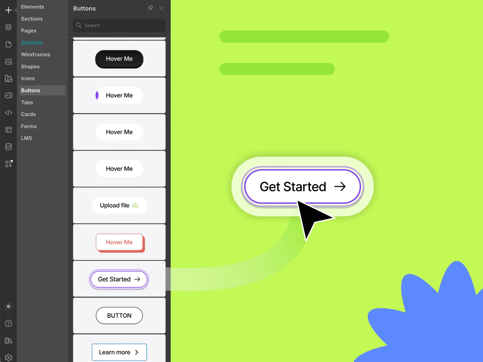
This is the most basic type of micro-interaction and one of the easiest to overlook.
Good button feedback generally includes:
-
Hover-state changes in color, shadow, or position
-
Compression or rebound feedback on click
-
Smooth transitions rather than abrupt switching
The value lies in:
helping users know that their click was registered instead of wondering whether they missed the button.
2️⃣ Scroll-Progress Indicators
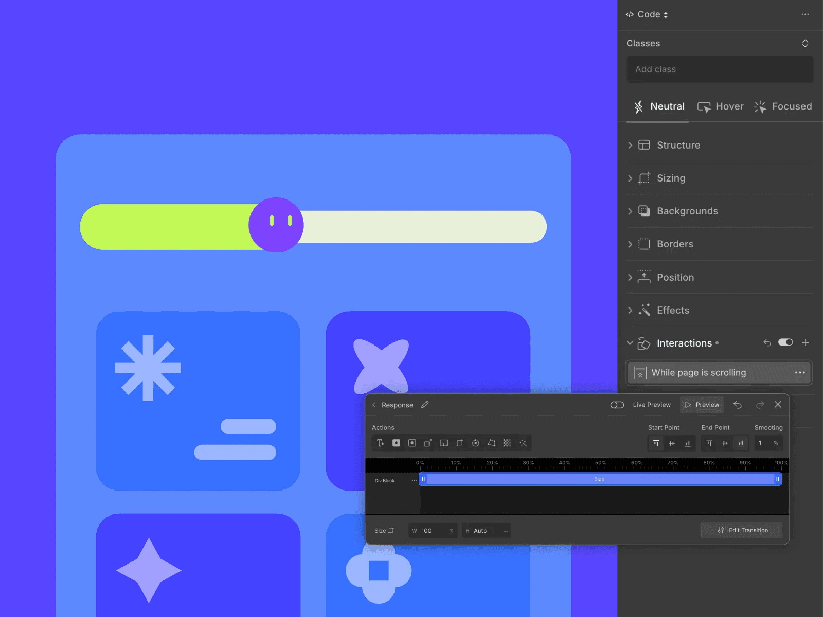
The primary purpose of a scroll-progress bar is not decoration, but to reduce reading anxiety.
At a psychological level, it communicates:
-
The content is finite.
-
How far the user has progressed.
-
Continuing to scroll is worthwhile.
It is especially suitable for:
-
Long-form articles
-
Case-study detail pages
-
Content-focused corporate websites
3️⃣ Elastic and Spring Transitions
Animation with a spring-like quality can feel natural, physical, and less mechanical.
It works well for:
-
Toggle switches
-
Expanding and collapsing cards
-
Hover feedback
⚠️ Note:
Elastic motion should be an accent rather than the main attraction. Overuse makes a design feel inexpensive.
4️⃣ Cursor Guidance and Follow Effects
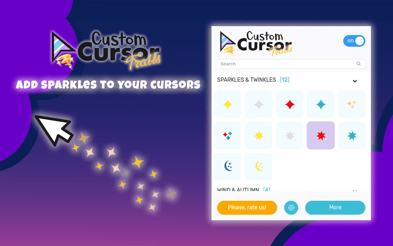
Cursor micro-interactions can be used to:
-
Emphasize the currently interactive area.
-
Create a memorable first-screen impression.
-
Support creative brand websites.
However, the experience at 58UI Design Studio suggests that:
Cursor interaction is appropriate primarily for presentation-focused pages,
not for high-frequency operations or complex functional pages.
5️⃣ Segmented and Character-by-Character Text Reveals
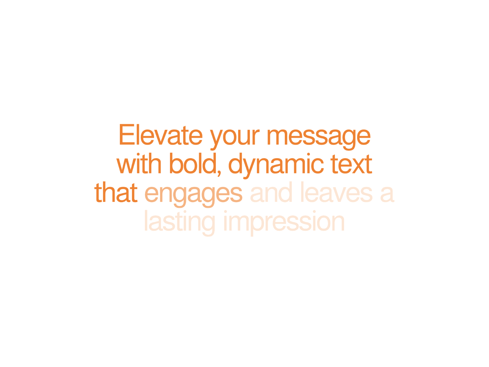

Text animation is often overused, but it can add considerable value in the right location.
It works well for:
-
Homepage headlines
-
Value propositions
-
Emphasis on key statements
It is not suitable for:
-
Long body paragraphs
-
Content intended for frequent reading
The principle is simple:
Animation should support information rather than compete for attention.
Five Fundamental Principles of Micro-Interaction Design
At 58UI Design Studio, we apply clear rules to micro-interactions:
-
Begin with user intent, not the designer’s personal interests.
-
Use them with restraint; more is not necessarily better.
-
Maintain consistency, because motion is also part of the brand.
-
Protect performance, especially on mobile devices.
-
Test across devices, so the effect does not work well only on the designer’s own computer.
The Real Value of Micro-Interactions
When designed correctly, micro-interactions can:
-
Increase certainty during operation.
-
Reduce hesitation and accidental actions.
-
Extend time on page.
-
Improve clicks and conversions.
-
Make a brand feel more thoughtful and professional.
Users may not consciously notice these details,
but they will feel that the website is comfortable to use.
Conclusion: The Best Experiences Are Often Hidden in the Details
Micro-interactions are not decoration. They are the lubricant of the experience.
A website without micro-interactions may be functionally complete,
but the experience often feels rigid, cold, and uncertain.
From the perspective of 58UI Design Studio:
A sophisticated design rarely comes from complexity. It comes from respecting the details.
If you are redesigning an official website, product, or brand,
begin by improving these seemingly small moments.