Summary: Simple information-acquisition tasks are less memorable, and users’ basic expectations include clear, easy-to-understand language. Complex research tasks require more effort; for these tasks, users expect more advanced support such as comparison tables and segmented content.
People’s needs vary according to the type of task they are performing. Finding a specific fact—such as the date of National Ice Cream Day—may require only a few keystrokes.
By contrast, a research task—such as understanding the causes and treatments of insomnia—may take days or even weeks.
Three Types of Tasks
In a recent large-scale survey study, we identified three distinct forms of online information-seeking behavior according to the purpose of the search:
-
Acquire: Users look up information, obtain product details, or download content. One participant, for example, searched for the steps of cardiopulmonary resuscitation.
-
Compare/Choose: Users evaluate multiple products or information sources in order to make a decision. One participant compared the prices and functions of several professional scientific instruments to determine which one to purchase.
-
Understand: Users develop a deeper understanding of a topic. One participant, for example, said that information found online led him to decide not to try the ketogenic diet.
We can distinguish these three information-seeking behaviors with a single example. Suppose your Wi-Fi router stops working. If you look up your service provider’s phone number, you are performing an Acquire task. If you decide to buy a new router and choose among several brands and models, you are performing a Compare/Choose task. If you want to learn more about how routers work, you are performing an Understand task.
These three tasks do not occur with equal frequency. Our research shows that critical information is more likely to be obtained through Understand and Compare/Choose activities than through Acquire activities.
This article examines the different characteristics of these three task types. We used data from several studies:
-
Critical incident study. In a survey, 498 respondents recalled the most recent occasion when they found important information online and consequently made a significant decision or took a significant action. We also asked about the context of the event: when it occurred, which device they used, and how satisfied they were with the process.
-
Search-behavior study. We analyzed 471 search instances from four different studies covering multiple task types. We used several measures to capture search behavior, including time to first click, the number of characters in search queries, and the page elements users clicked or viewed.
-
Usability-testing study. We included data from search tasks conducted in two groups of usability tests.
Acquire Tasks: Less Memorable
In our critical incident study, we asked respondents when the reported event had occurred. Most Acquire events (57%) had taken place within the previous week, compared with only about one-third of events involving the other task types. (These differences were statistically significant in N-1 chi-square tests: p < 0.001 for Acquire versus Compare/Choose, and p < 0.001 for Acquire versus Understand.) By contrast, only 8% of Acquire events had occurred more than three months earlier, compared with 29% of Compare/Choose events (p < 0.05), and 23% of Understand events (p < 0.05). This finding suggests that Acquire tasks are less memorable than Compare/Choose and Understand tasks.
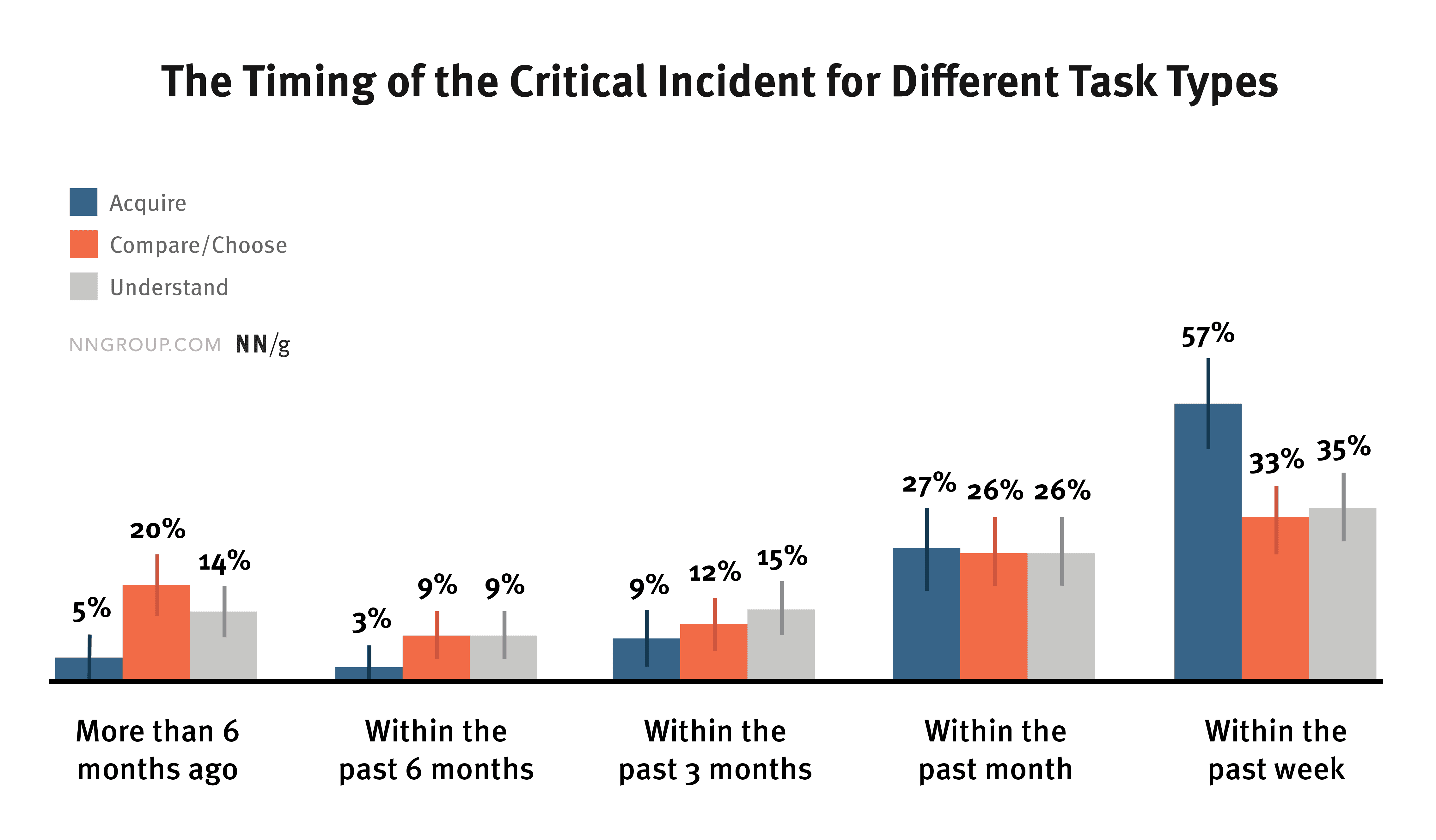
People reported more Acquire events from the previous week, but more events from the previous three months involved Compare/Choose and Understand critical incidents. This distribution may reflect how well people remember these events and suggests that Acquire activities are less memorable than the others.
Why do people forget earlier Acquire activities more easily than earlier Compare/Choose or Understand activities? Our hypothesis is that Acquire activities are usually simpler and therefore require less time; as a result, people have less opportunity to commit them to memory.
For example, one respondent described an Understand task she had completed six months earlier: “I learned that my child had a congenital heart condition, so I searched for information online. Based on what I found and my doctor’s advice, I decided to have my child undergo a heart scan at the age of one rather than waiting until he was older.” We can imagine the time and effort she invested in understanding the benefits and risks of performing the scan while her child was still very young before making this important decision. Another respondent reported a typical Acquire task completed the previous week: “I found a DSW coupon online and used it in a physical store.” Clearly, this task required far less effort and fewer cognitive resources than the first.
(The emotional weight of the Understand activity in the example above certainly contributed to its memorability, but we do not necessarily have evidence that Understand or Compare/Choose tasks are generally more important or emotionally powerful than Acquire tasks. We simply asked users to recall important experiences of using the web. If any graduate students are reading, an interesting follow-up study could investigate the emotional impact of people’s online experiences.)
Our search meta-analysis project provides additional evidence for the hypothesis that Acquire tasks require less effort. The meta-analysis used a classification system that differed slightly from the one in our critical incident study. Based on task complexity, it included three categories: fact finding, navigation, and research. Fact finding and navigation resemble Acquire tasks, while research tasks map to Compare/Choose and Understand tasks.
We analyzed how long users remained on a search-engine results page before clicking their first result and found that they spent significantly more time on research tasks than on all other task types combined (p < 0.01). In addition, users were much more likely to revise their search queries during research tasks than during all other task types combined (p < 0.01), and they used more characters in their queries during research tasks (p < 0.001). Note that this analysis covers only the time spent on the search-engine page and does not include time spent after clicking a link. If the complete duration of every task type were considered, the differences might be even larger.
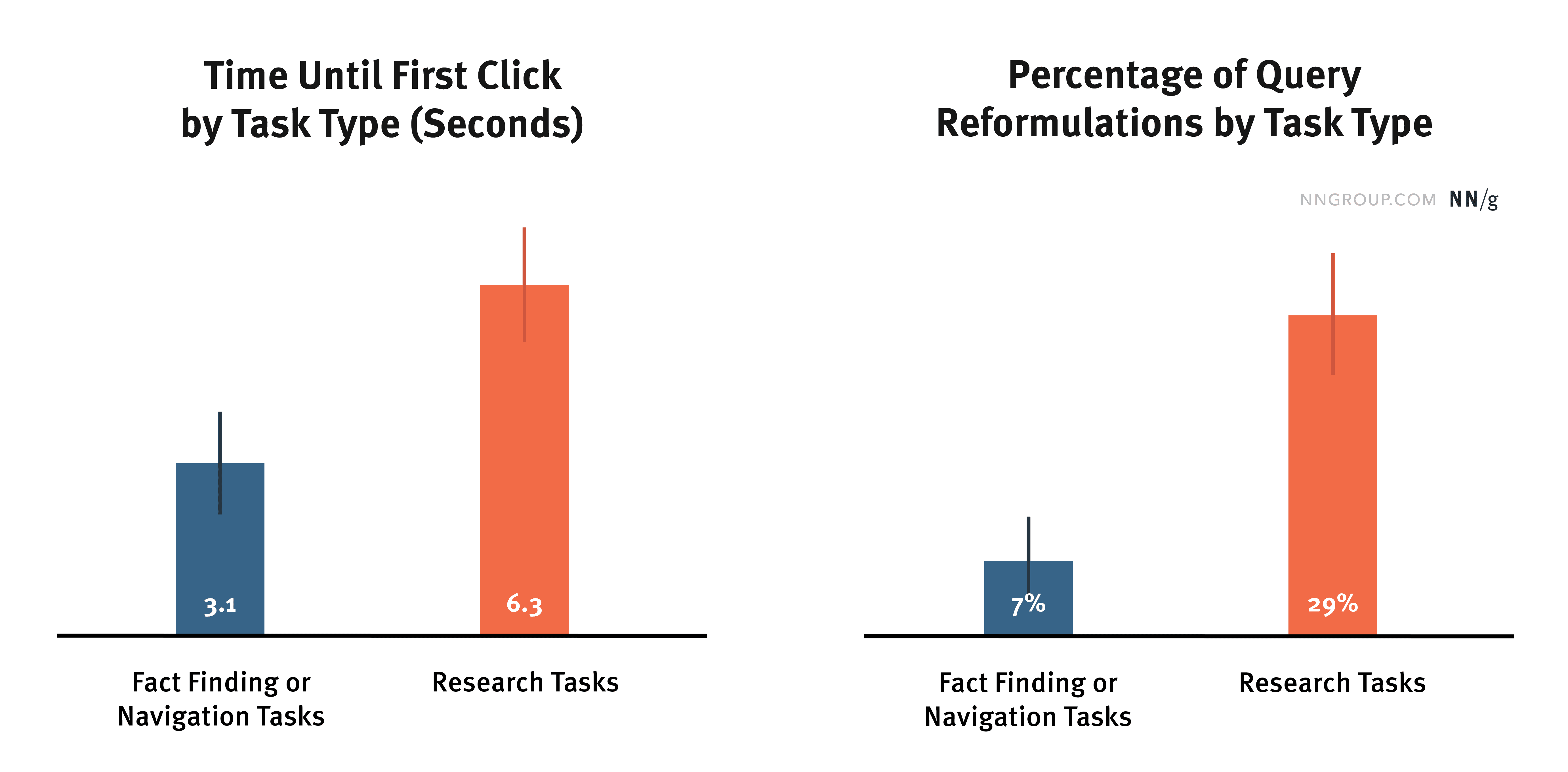
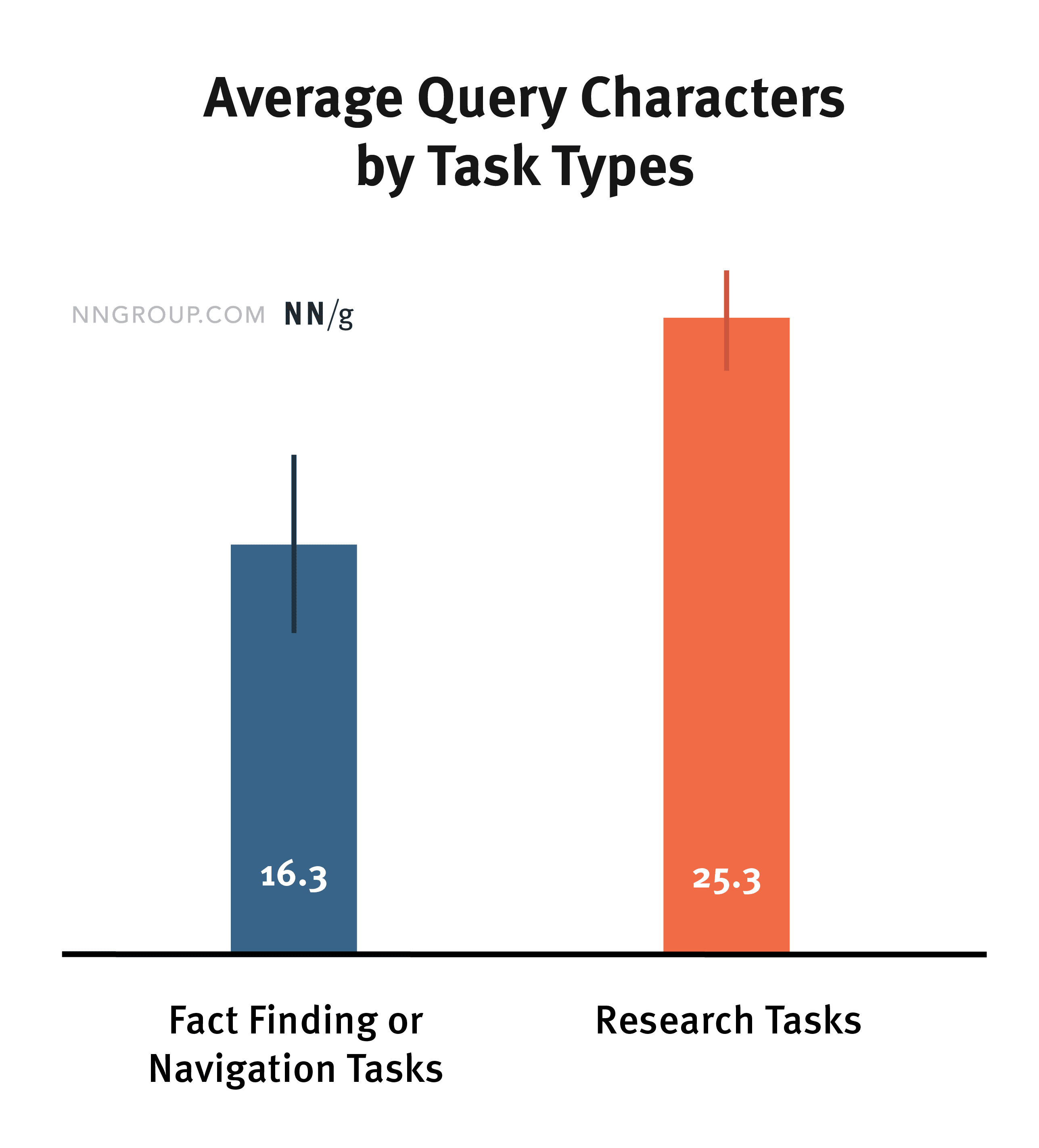
These three charts show that people invested more effort in research searches than in navigation and fact-finding searches combined. Specifically, they spent more time before the first click on the search-engine results page (SERP), used more characters in their queries, and were more likely to reformulate research queries.
Acquire Tasks: Higher User Satisfaction
In our critical incident study, we asked participants to rate their satisfaction with the websites or applications they had used during the reported event, on a scale from 1 (very dissatisfied) to 5 (very satisfied).
Compared with respondents who completed Understand or Compare/Choose tasks, respondents who completed Acquire tasks were more satisfied with the websites they used. (Both differences were statistically significant at p < 0.05.)
However, the difference was small: Acquire tasks received ratings only 0.2 points higher than the other two task types. In addition, the average satisfaction score for all three categories was relatively high, exceeding 4. This high level of satisfaction may reflect survivorship bias: every reported event involved successfully finding information and ultimately making an important decision, because that was what respondents had been asked to recall. Cases in which people failed to find information were therefore not included in the study.
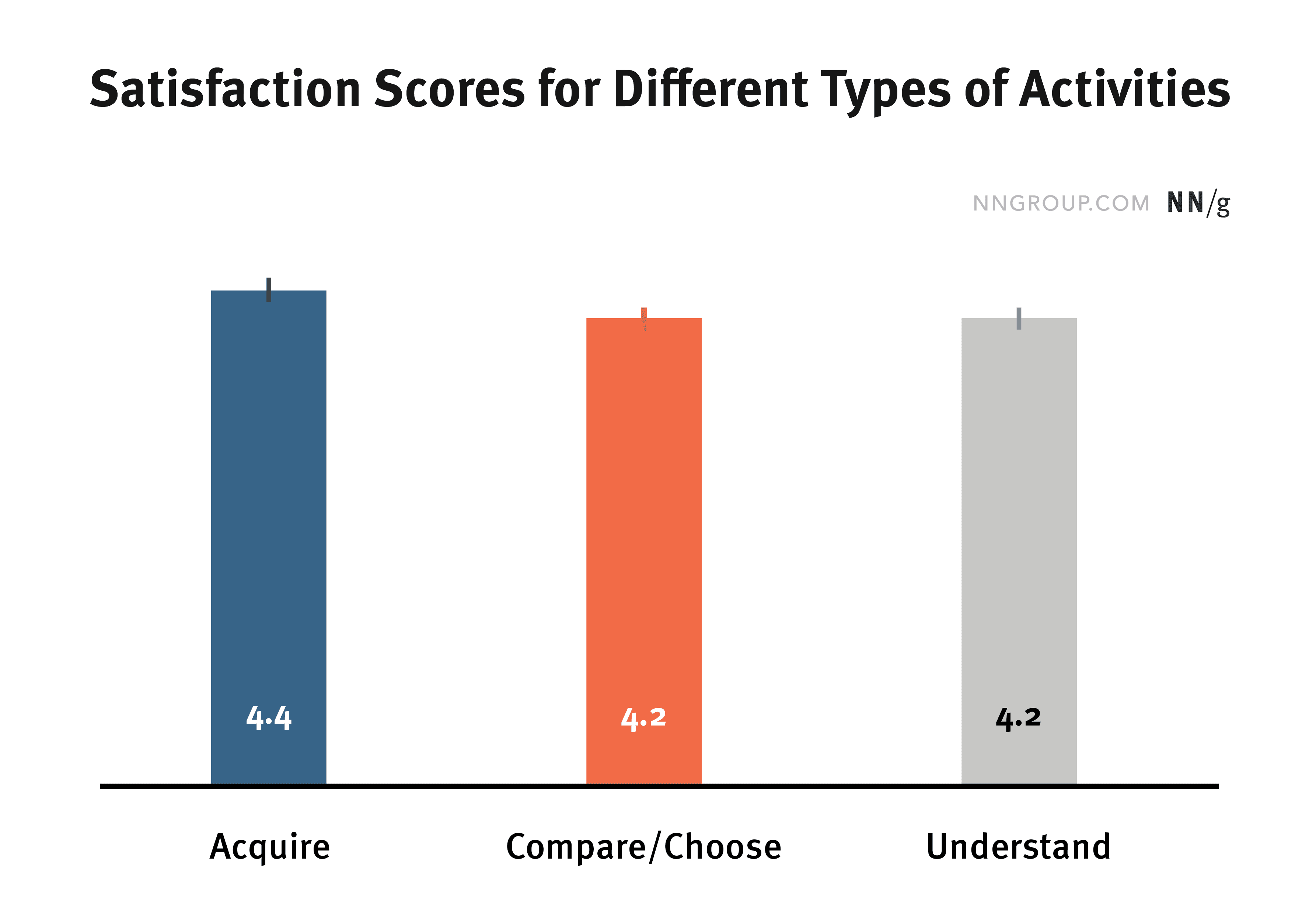
Compared with Acquire tasks, respondents were less satisfied with the applications and websites used for Compare/Choose and Understand activities.
Users’ Main Expectations for Different Task Types
To understand what users expect from different types of tasks, we applied thematic analysis to 190 open-ended comments about the websites or applications used during the reported critical incidents. For each task type, we identified the issues mentioned most frequently. These expectations are not mutually exclusive. For example, requests for plain language appeared in both Acquire and Understand incidents, but the issue was mentioned more often for Acquire tasks. Understanding the leading expectations for each task type can therefore help designers avoid the most common mistakes associated with each one.
Acquire Tasks: Fast, Direct, and Simple
A quick process with fewer clicks
When people are trying to obtain a fact, document, or other piece of information, they want the process to be fast and convenient, with as few steps and clicks as possible. This benefits all search activities, but our research suggests that users performing Acquire tasks are especially impatient. Compared with users performing Compare/Choose or Understand tasks, they mentioned “faster loading” and “fewer clicks” more frequently. (The differences were statistically significant: p < 0.01 for the number of such comments about Acquire versus Compare/Choose tasks, and p < 0.001 for Acquire versus Understand tasks.)
One respondent, for example, wrote: “I am a lawyer and often use the internet to look up real-estate title information and other records. I would like repetitive tasks to require fewer clicks.” Another respondent said she had found a dinner discount online and saved a significant amount of money; she wished that “the relevant information had been easier to find.”
Provide an immediate, direct answer.
Users performing Acquire or Understand tasks expressed a significantly greater need for direct answers than users performing Compare/Choose tasks (p < 0.01 for both comparisons). Their priorities differed slightly, however. For Acquire tasks, users generally wanted “direct information,” whereas users performing Understand tasks were more likely to want “specific information” related to the topic they were investigating.
A user trying to find out “how to reset a car’s oil-change mileage reminder” said: “I wanted to find the information faster, and I wanted the answer to be more direct.”
Search-engine features such as featured snippets and knowledge panels address users’ need to obtain factual information quickly. They display answers to fact-based questions directly on the results page, saving users additional clicks and reading.
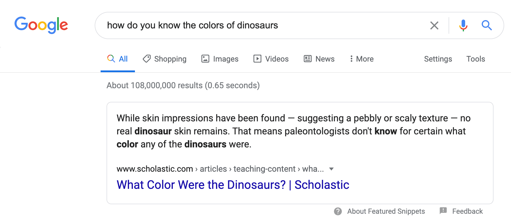
In our research on the usability of children’s websites, children used a featured snippet on Google.com to answer the question, “How do we know what color dinosaurs were?”
Clear, plain language
One respondent wrote: “I was looking for information about chickens, and the information online helped me determine whether a chicken was a rooster or a hen.” She wanted “information that was easier to understand.”
One usability-test participant was asked to look up the term “gerrymandering.” She searched for it, but Wikipedia’s complex wording overwhelmed her. She stopped reading and switched to Simple English Wikipedia, which provides easier explanations, and found it much more understandable. Commenting on the first Wikipedia page, she said: “It was full of words I did not know. The way it began made me decide not to keep reading.” Here are the two definitions:
-
Wikipedia: “Gerrymandering is the practice of setting boundaries of electoral districts to favor specific political interests within legislative bodies, often resulting in districts with convoluted, winding boundaries rather than compact areas.
-
Simple English Wikipedia: “Gerrymandering is when a political group tries to change a voting district to create a result that helps itself or hurts groups that oppose it.”
Users do not want to spend excessive time or effort on Acquire tasks. If your website primarily supports this type of activity, study how your target audience phrases its questions. Use clear, plain language to increase the likelihood that more users will understand and accept the content.
It is worth noting, however, that participants performing Understand tasks also requested easy-to-understand language, and the proportion expressing this need did not differ significantly between the two groups. Because plain language benefits every task type, this finding is reasonable.
Compare/Choose Tasks: More Information and More Support Tools
The following were the most common comments about Compare/Choose tasks:
From companies and customers: comprehensive information and descriptions, presented in multiple formats such as images and video.
Several participants in our critical incident study complained that information was insufficient:
-
“My mother was going to have major surgery, so I went online to research the surgeon who would operate on her. I would add anonymous personal reviews from other patients to the doctor’s page.”
-
“I was choosing my first apartment. I wanted better photographs that represented all of the apartments more accurately.”
-
“We were evaluating our cable and internet service. We researched different plans online to determine which one best met our needs. It was difficult, however, to find objective and unbiased information about most products and services. Most of the content was sales language.”
When making Compare/Choose decisions, people place considerable value on information from multiple perspectives. For example, when we asked usability-test participants to read an article about the Sonos One speaker and decide whether to purchase it, many examined the user reviews on the article page and even visited Amazon and Reddit to see what customers said about the product. People are sensitive to “marketing language,” however, and do not trust content that sounds excessively focused on selling.
Although users performing every task type appreciated multimedia, only those performing Compare/Choose tasks mentioned the need for information from multiple perspectives. Providing varied information can therefore help them make decisions with greater confidence.
Present key information first
One major requirement of Compare/Choose tasks is to display pricing information prominently from the beginning. This is a distinctive need among users making comparisons: they want to increase efficiency by minimizing the work required to find the key information for each product.
For example, a respondent searching for information about nursing homes and assisted-living facilities wanted costs to appear on the homepage. Another user trying to buy glasses from Warby Parker wanted to know the prices of different lenses, but the homepage displayed only images of glasses and no pricing information.
Hiding information that users want is dangerous. People may assume that the information does not exist and leave the website simply because they cannot find it.
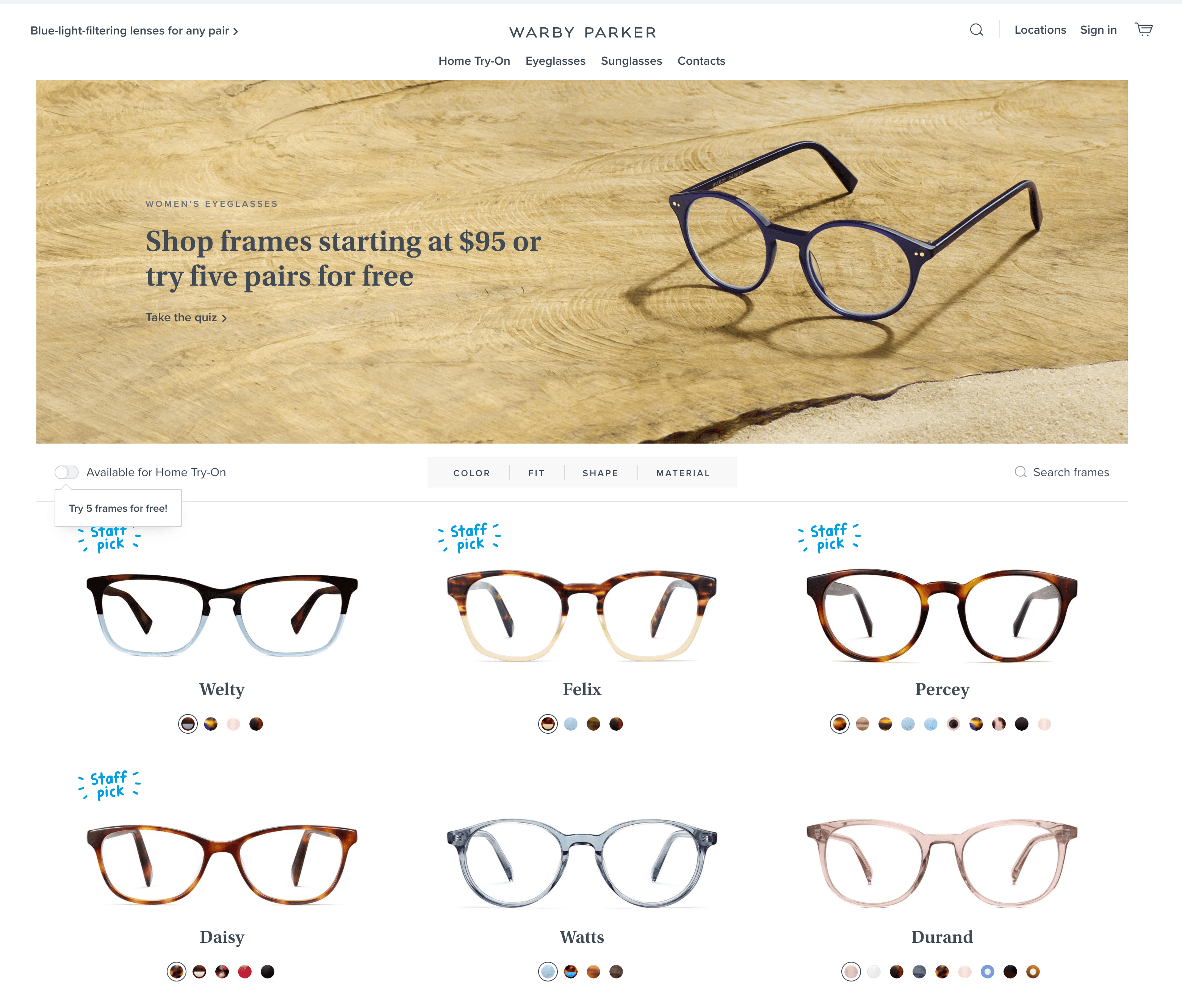
On Warbyparker.com, eyeglass prices were not displayed on the search-results page. Users had to visit each product-detail page to see the price of a pair of glasses.
Comparison tables
A good comparison table can address the main difficulty users encounter during Compare/Choose tasks: comparing critical product attributes.
Here are several user comments:
-
“I searched online for kitchen-appliance prices from eight to ten companies, then created a spreadsheet to monitor each store’s prices for a year. I wish the process could have been automated so I would not have needed to check prices every week.”
-
“I was researching the elliptical machine that best suited my needs. I wanted the websites to make it easier to compare different models and brands on one screen.”
A usability-test participant strongly praised the product-comparison feature after being asked to learn about Wells Fargo credit cards:
“The credit-card comparison table was excellent. It highlighted the key features, included all the details, and organized everything clearly so I could compare the cards on one screen—for example, how long it would take before each card’s annual percentage rate changed.”
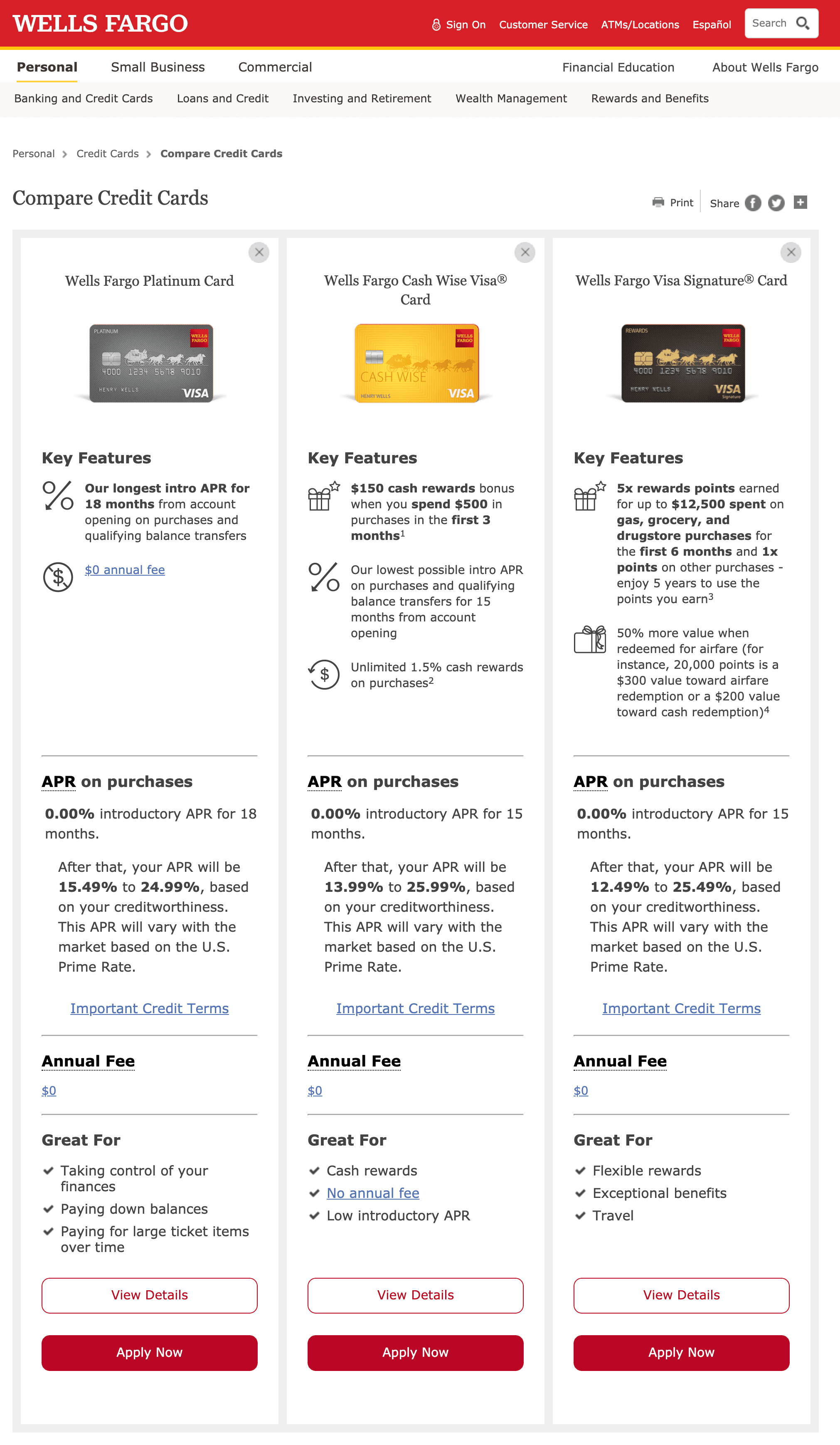
Wellsfargo.com: A research participant praised the credit-card comparison table.
For Compare/Choose tasks, research which information customers value most when making decisions. Present that information clearly and design tools that help them compare alternatives and select the right product. These tools can reduce their cognitive load.
Understand Tasks: Clear, Comprehensive Information and Fewer Advertisements
The following were the most common comments from users reporting Understand tasks:
Clear, well-organized content.
When people conduct research online, they are already working to acquire knowledge about an unfamiliar subject. The content and its format should support learning.
One respondent trying to understand the cause of her difficulty swallowing commented: “I had to read a large block of information very carefully. It might have been better to use bullet points for the main ideas and reduce the number of paragraphs.”
Create subheadings that support effective scanning and divide content into meaningful chunks. This helps people understand the page structure, locate the information they want, and comprehend the material more effectively.
In one of our usability tests, users praised the way the Humira website presented the medication’s side effects. The subheading “What should I watch for after starting Humira?” appeared in bold red text and contrasted clearly with the body content. In addition, the key term for each side effect was bolded so users could find it quickly.
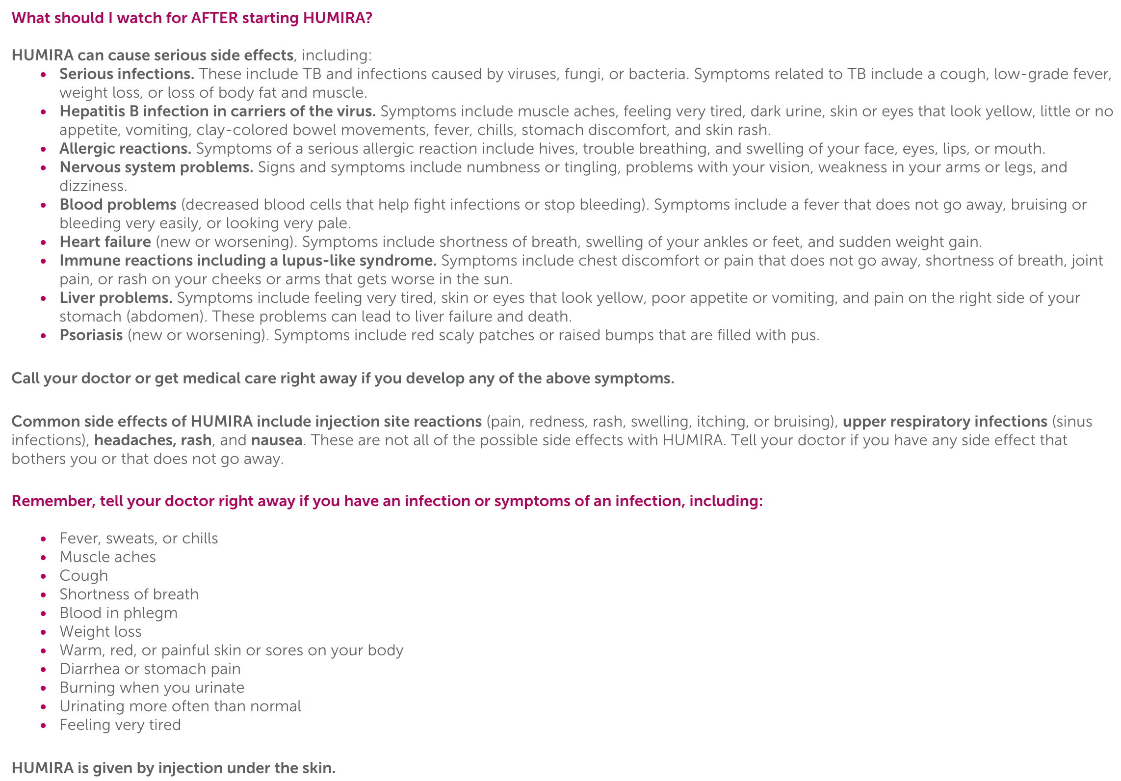
Humira.com. Users praised its clear, well-organized layout, which used bullet points, bold headings, and emphasized keywords to make the content easy to understand.
Among users performing Understand tasks, significantly more people mentioned information clarity than among users performing either of the other two task types (p < 0.05 for both comparisons). This finding is likely because reading is central to Understand tasks; clear and well-organized content therefore provides the greatest assistance.
Centralized information
Although Understand tasks often require integrating information from several websites, users still want everything to be available in one place.
For example, a respondent searching for a list of unhealthy foods commented: “I would like all the information to be consolidated on one page instead of having to click several times to obtain more details.”
A usability-test participant wanted to learn more about visiting Beijing’s Summer Palace. To develop a complete understanding, she visited three different websites: a long article describing the attractions and their historical background, a short article containing photographs and names of the attractions, and a map website. She said: “I wish all the information I needed could have been available on one website.”
Users performing Acquire and Understand tasks both requested centralized information. Whether the task is simple or difficult, providing relevant information directly on your website can substantially reduce the user’s workload.
Fewer advertisements
Users complained about advertising across all task types, but people performing Understand tasks were especially likely to say that advertisements were distracting. One user researching a school project, for example, said: “The advertisements distracted me and made it harder to read and understand the important information.”
To prevent advertisements from interfering with users, place them where people expect to find them and provide high-quality content before presenting promotional material.
During a usability test, we asked a participant to find instructions for composting at home. On the EarthEasy website, the homepage had an attractive background image beside two buttons: “Read the Guide” and “Shop Products”. She hesitated for several seconds before selecting “Read the Guide”, then ultimately left the website without scrolling or clicking another button. “I was skeptical,” she said. “‘Shop Products’ and ‘Read the Guide’… I do not want to look at advertising. Give me what I need first, and show me the advertisements afterward.” She greatly preferred another article on Better Homes & Gardens. She had no complaints about its advertising because the page placed advertisements in the right sidebar and linked only to promoted products relevant to the content.
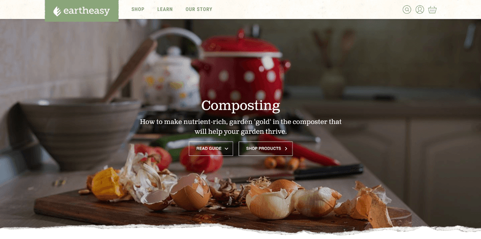
Eartheasy.com: Because useful content was not visible, the user assumed that the website consisted entirely of advertising.
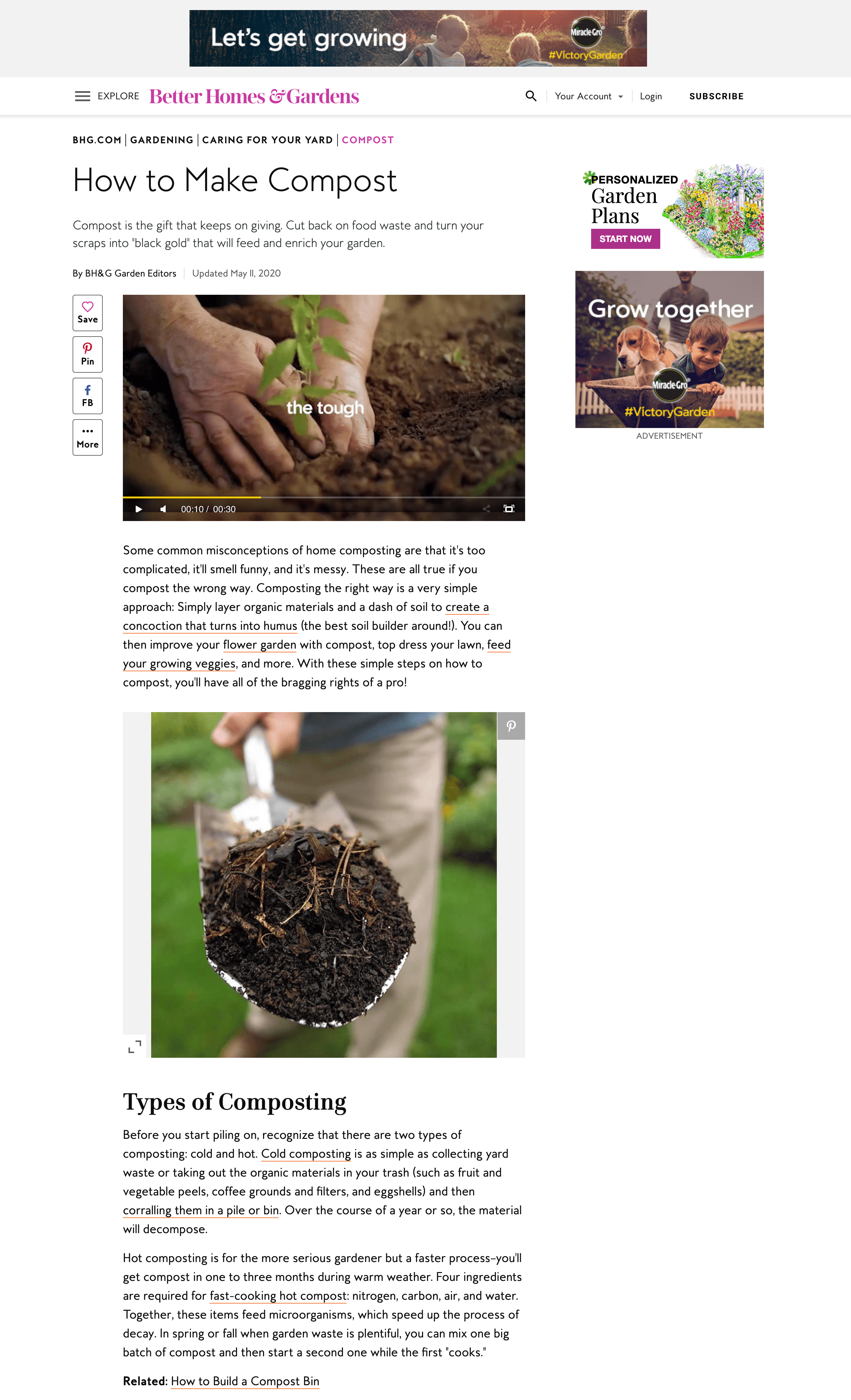
Bhg.com. This information-rich article placed advertisements in expected locations at the right and top of the page and linked only to promoted products relevant to the content. One user read the entire article, found it helpful, and did not complain about the advertising.
Conclusion
People search for information online constantly. Our research shows, however, that they devote different levels of attention to different information-seeking tasks. Shorter, simpler fact-finding activities are generally easier to forget. Research-intensive tasks such as Compare/Choose and Understand, by contrast, require more effort: users spend more time thinking before clicking, use more characters in search queries, and reformulate those queries more frequently. These tasks remain memorable for longer, yet users are less satisfied with the support provided by websites. It is therefore essential not only to support the basic activities users perform frequently, but also to monitor success on less common, more complex tasks, because those experiences may have a stronger effect on their overall impression of a website.
Our research also shows that users have different expectations for different task types. For Acquire tasks, the most common expectations are faster and more direct access to information and the use of plain, understandable language. During Compare/Choose tasks, users want information from multiple perspectives and tools that support the decision. For Understand tasks, users place greater value on clearly organized and comprehensive content.
This does not mean that designers can ignore fact-finding expectations when supporting research-based tasks. Few complex tasks belong entirely to a single category. A research task usually consists of several simpler activities. Comparing and choosing among router brands, for example, can be broken into “finding facts about Model A and Model B,” “synthesizing information,” “comparing the options and weighing their advantages and disadvantages,” and “making a decision.” Expectations for simple tasks should therefore serve as the baseline for complex tasks. Designers should also study the user flows of complex activities to support transitions between simple subtasks and the possibility of moving back and forth among them.