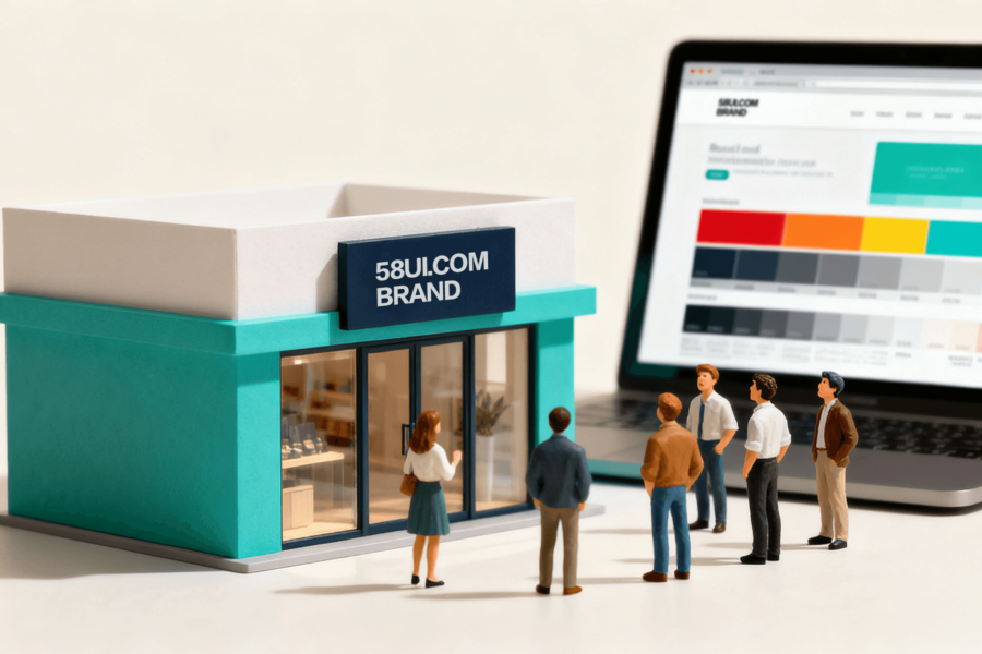
Does your company website feel as though it is missing that final touch of refinement? Perhaps heavy photo filters make it feel artificial, while unedited images seem insufficiently professional. There is no need to worry. As a team focused on strong design and user experience, 58UI explains how visual design can transform an ordinary website into a branded destination that makes visitors want to stay.
1. First Impressions Are Critical: The First Screen Must Do More Than Display Content
Users typically decide whether to continue browsing within the first three seconds of arriving at a website. If the homepage is filled with a company introduction, corporate history, and even a message from the chairman, the user’s first reaction is often: “This is far too much.”
The solution:
-
Use the first screen to emphasize the most important message, such as the main product, service benefit, or brand promise.
-
Combine a visually powerful background with a clear button that guides users toward the next action.
-
Add restrained animation, such as a color change when hovering over a button or an image that rises slightly, to make the experience feel active without becoming distracting.
2. Typography and Color: Do Not Let the Page Look Like a Color-Palette Disaster
Too many typefaces and colors create visual confusion and weaken the experience. In a strong visual identity system, two typefaces are usually sufficient—one primary and one supporting typeface—along with one primary color, one secondary color, and one accent color.
Color recommendation: Use the 60-30-10 rule
-
60% primary color, usually the main brand color
-
30% secondary color, used for backgrounds, headings, and supporting areas
-
10% accent color, used for buttons, links, and key information
When selecting typefaces, prioritize highly readable combinations and choose styles that match the brand’s character, whether serious, technological, warm, or something else.
3. Imagery and Photography Should Feel Real: Move Beyond Templates and Staged Scenes
Corporate websites often use photographs of artificial smiles, staged handshakes, and posed meeting rooms. Although these images may appear “professional,” they often feel overly performative. Genuine team environments and candid photographs of people at work create greater trust.
The same principle applies to product imagery:
-
Contextual images help users imagine themselves using the product more effectively than isolated product photographs.
-
Lighting, texture, and material details should feel authentic. Excessive post-production filters are not recommended.
4. Quick Tips: Design Details That Make a Website Look Ten Times More Premium
-
Use a simple but impactful visual element and a clear guiding button in the first screen.
-
Build typography around whitespace, alignment, and hierarchy.
-
Maintain a consistent color palette and use brand colors to anchor the visual style.
-
Use animation efficiently without disrupting the rhythm of the page.
-
Use authentic imagery and contextual scenes to strengthen emotional connection and user trust.
Conclusion
Truly effective visual design does not pile decoration into the first screen. It integrates user experience and brand character into every detail. When users open your website, they should not simply pass through—they should want to remain and explore.
At 58UI Design Studio, we specialize in visual enhancement and user-experience optimization, using design to make brands appear more professional and trustworthy. If you want to strengthen your corporate image and reduce the number of visitors who click “Exit,” contact us. Together, we can refine your website into an experience that people want to stay with.