In 2026, leading global color authorities—including PPG, Pantone, and the major fashion weeks—are converging on one key idea: yellow-green (Yellow-Green / Chartreuse / Secret Safari). It is not a single shade, but a family ranging from bright lime and fresh sprout green to olive yellow-green. With its combined qualities of natural vitality, futuristic technology, and emotional restoration, it has become one of the year’s defining color trends across design, branding, products, and spatial environments.
This article explains why yellow-green has become so influential and how to use it effectively, covering the roots of the trend, color psychology, applications in UI, graphic, interior, and fashion design, recommended palettes, and practical implementation techniques.
1. Why Yellow-Green Was Destined to Become a Leading Color Trend in 2026
1. Collective Recognition from Major Color Authorities
-
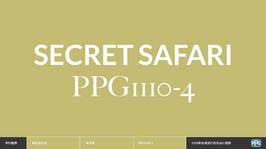
PPG 2026 Color of the Year: Secret Safari (PPG1110-4)
Defined as an “earthy yet futuristic yellow-green,” it represents exploration, optimism, and a connection between nature and parallel digital worlds.
-
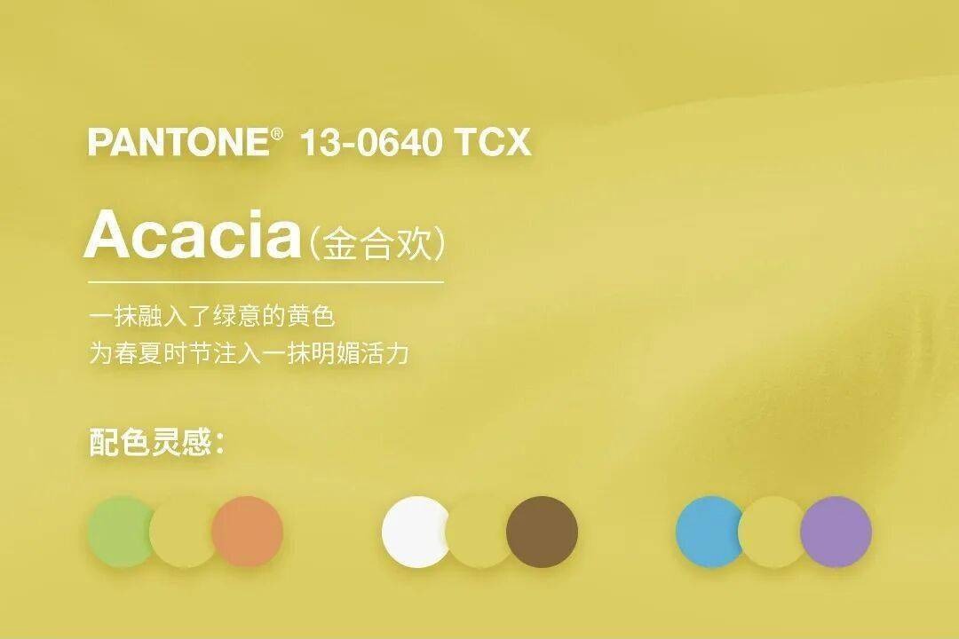
Pantone Core Colors for Spring/Summer 2026
Acacia, Lime Green, Ragweed Green, and fresh sprout shades all share yellow-green undertones and emphasize restoration, lightness, and vitality.
-
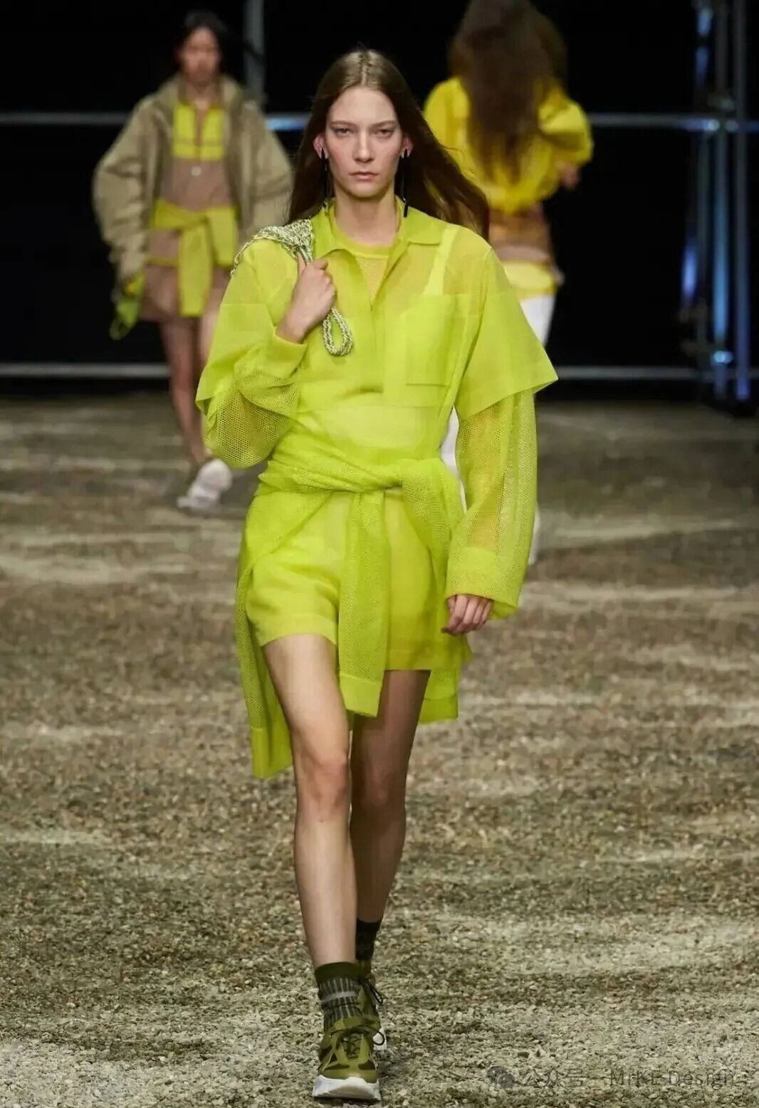
Milan, London, and New York Fashion Weeks for 2026
Yellow-green, especially chartreuse, appears as a core statement color throughout the collections, ranging from highly saturated neon to low-saturation misty tones and moving decisively into the mainstream.
2. Color Psychology: A Perfect Balance of Energy and Calm
-
Yellow: Conveys happiness, attention, energy, and optimism
-
Green: Conveys nature, healing, relaxation, safety, and vitality
-
Yellow-green:Combines both qualities, creating a color that is energizing without being harsh and vivid without losing stability
It is particularly suited to the post-pandemic era, when people seek the combined emotional qualities of natural restoration, positive energy, and technological futurism.
3. The Cultural Context: Three Major Trends Converge
-
A Return to Nature and Sustainability: Evokes plants, new growth, environmental awareness, and organic principles
-
AI and the Digital Future: Highly saturated versions naturally feel cybernetic, technological, and neon
-
Emotional Design: Low-saturation matte yellow-greens communicate calm, warmth, and refinement
2. The Three Main Yellow-Green Style Families for 2026
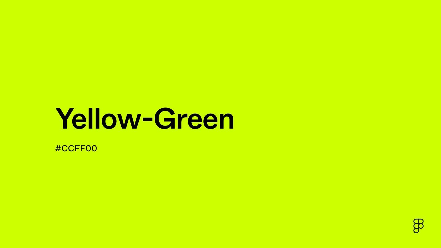
1. Electric Chartreuse
-
Reference color values:
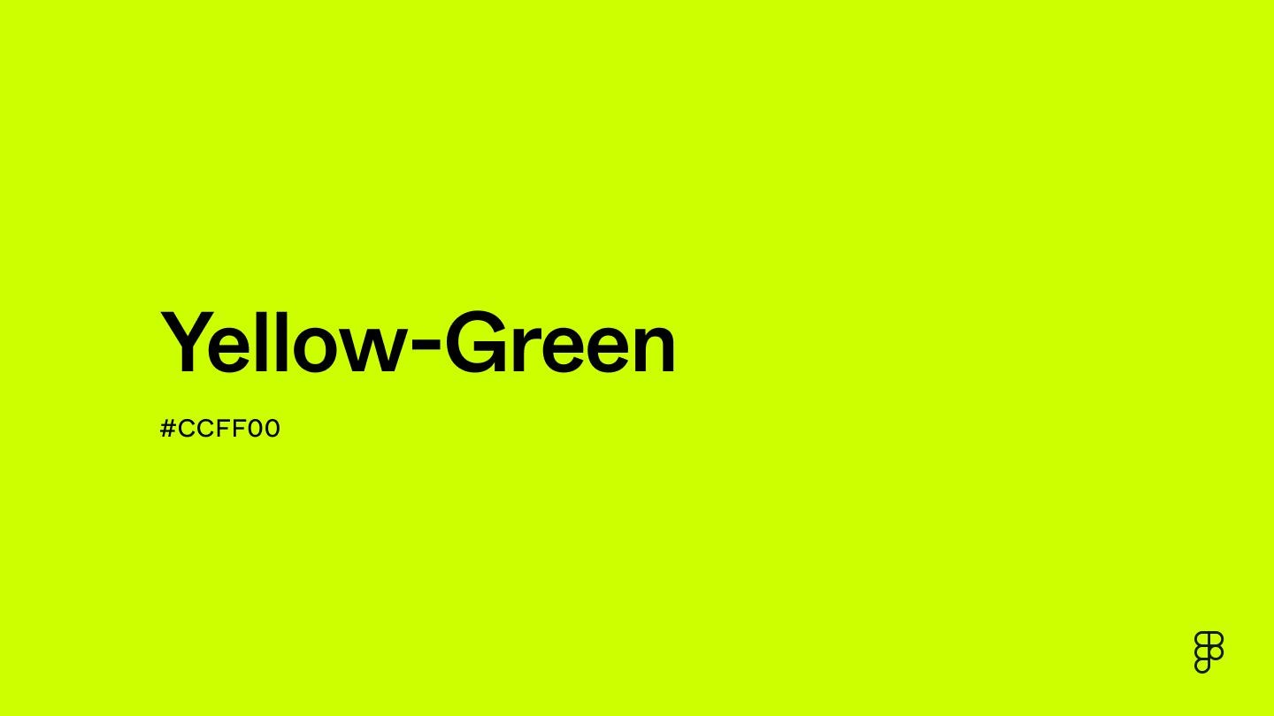
#CCFF00/RGB(204,255,0) -
Character:Futuristic, energetic, youthful, attention-grabbing, and cyberpunk
-
Best for: Technology products, internet apps, streetwear brands, youth-oriented UI, and poster primary colors
2. Pastel Yellow-Green
-
Reference color values:
#E8FF8A/#D9F59F -
Character:Fresh, restorative, gentle, springlike, light, and quietly luxurious
-
Best for: Beauty, skincare, health, education, maternal and baby products, minimalist UI, and interior walls
3. Olive Yellow-Green / Secret Safari
-
Reference values: PPG1110-4 /
#A9B27C/#B8C18E -
Character:Retro, premium, composed, natural, organic, understated luxury, and retro-futurist
-
Best for: Premium brands, interiors, fashion, automotive design, packaging, and stable financial or technology interfaces
3. Practical Applications of Yellow-Green in UI and Web Design: 2026 Trends
1. Primary Color for Technology-Driven and Energetic Apps
-
Suitable for: AI tools, creative platforms, social products, fitness, new energy, and youth-oriented brands
-
How to use it:
-
Use bright yellow-green for primary buttons, accent elements, and the brand color
-
Pair it with white, light gray, dark charcoal, or black for a clean, modern result
-
Pair it with deep blue or indigo for one of the strongest combinations of technology and nature
-
2. Supporting Accent Color Suitable for Almost Every Industry
-
Yellow-green is one of the safest highlight colors for 2026: softer than yellow, more noticeable than green, and younger in character than orange
-
Use it for:
-
Buttons, notifications, tags, progress indicators, and links
-
Empty states, onboarding pages, and card accents
-
Data visualization and chart highlights
-
3. Low-Saturation Misty Yellow-Green for a Calm, Premium Interface
-
Suitable for: Health, meditation, education, finance, and productivity tools
-
Characteristics:Low saturation plus high lightness, creating an eye-friendly, stress-reducing, premium effect
-
Pair with off-white, oat, light gray, misty blue, or pale violet
4. Accessibility Considerations
-
Bright yellow-green on a light background can provide sufficient contrast for buttons
-
Use highly saturated yellow-green cautiously for text; large or bold type can work
-
Misty yellow-green is better suited to large surfaces and text backgrounds
4. Four Recommended Yellow-Green Palettes for 2026
Palette A: Futuristic Technology for UI, Digital Products, and Streetwear
-
Primary: Bright yellow-green
#CCFF00 -
Pair with charcoal black
#1A1A1A+ pure white#FFFFFF+ light gray#F0F2F5 -
Effect: Sharp, modern, technological, and highly recognizable
Palette B: Natural Restoration for Health, Education, and Home Design
-
Primary: Misty yellow-green
#D9F59F -
Pair with oat white
#F8F5E8+ pale gray-blue#E6EEF5+ sand#F0EAD6 -
Effect: Calm, soft, airy, and restorative
Palette C: Earthy Understated Luxury for Premium Brands, Interiors, Fashion, and Finance
-
Primary: Olive yellow-green
#A9B27C(Secret Safari) -
Pair with off-white
#F5F2EB+ deep brown#5D4B3C+ warm gray#D6D2C8 -
Effect: Premium, retro, organic, and composed
Palette D: Fashion-Forward Contrast for Fashion, Graphic Design, and Marketing
-
Primary: Bright yellow-green
-
Pair with lavender
#E2D9F3/ orange-pink#FFCCBC/ deep ocean blue#1A365D -
Effect: Fashionable, attention-grabbing, artistic, and youthful
5. Cross-Disciplinary Applications of Yellow-Green in Graphic, Interior, Fashion, and Product Design
1. Graphic Design and Branding
-
Posters and packaging: Yellow-green plus black and white creates the strongest visual impact
-
Logo and visual identity: A leading brand-color choice for 2026, combining nature, technology, and youth in a single system
2. Interior Design
-
PPG’s primary recommendation for 2026: Secret Safari walls combined with natural wood, glass, and metal
-
Style: Modern understated luxury, natural organic design, and retro futurism
3. Fashion
-
A leading color across the spring/summer 2026 runways: yellow-green suits, trench coats, knitwear, and accessories
-
Pair with denim, white, black, khaki, pale blue, or violet
4. Product Design
-
Consumer electronics, appliances, and automotive interiors: misty or olive yellow-green creates a more premium appearance
-
Beauty and skincare: fresh yellow-green communicates natural, organic, and refreshing qualities
6. Five Essential Techniques for Designers Using Yellow-Green
-
Use low saturation over large areas and high saturation in small areas
-
Use bright yellow-green only for accents or buttons; misty yellow-green can cover larger backgrounds
-
-
Greater lightness often feels more premium than greater saturation
-
The 2026 preference is for high lightness with low-to-medium saturation, avoiding harsh fluorescent intensity
-
-
Build on black, white, and gray, then use yellow-green as the accent
-
Keep neutrals at 70–80% and yellow-green at 10–20% for the safest and most balanced result
-
-
Pair with cool colors for technology or warm colors for nature
-
Cool colors such as blue and gray create a futuristic technological effect; warm colors such as cream, brown, and wood create a natural organic effect
-
-
In UI, prioritize web safety and accessibility
-
Use bright yellow-green for buttons and misty yellow-green for backgrounds or supporting text areas
-
Conclusion: Yellow-Green Is the Universal Emotional Color of 2026
In 2026, yellow-green is more than a color. It is an answer to the emotional character of the era:
-
It connects nature and technology
-
It balances energy and calm
-
It accommodates youthfulness and premium refinement
-
It extends across UI, graphic, interior, fashion, and product design as a complete cross-disciplinary trend
For designers:Ignoring yellow-green this year means overlooking a major mainstream trend.
From brand colors and interface accents to packaging and spatial design, precise and restrained use of yellow-green can align work instantly with the 2026 aesthetic while increasing modernity and communication impact.
FAQ
Q: How is the yellow-green trend of 2026 different from ordinary green or yellow?
A: Yellow-green is the intermediate color between yellow and green. It is softer than yellow, more noticeable than green, more energetic and futuristic, and naturally associated with restoration and the natural world.
Q: Which industries are suitable for yellow-green in UI design?
A: Almost every industry, including technology, AI and the internet; health, education, and meditation; finance and new energy; creative, design, and social products; and e-commerce and retail.
Q: How should designers choose between low-saturation and high-saturation yellow-green?
A: Use low-saturation yellow-green for large areas, text, and backgrounds; use high-saturation yellow-green for buttons, emphasis, and small accents.