
Before discussing why color contrast matters for web accessibility, we first need to define what color contrast is.
Color contrast is the difference in brightness between a foreground color, such as text, and its background. If the values of the foreground and background colors are too similar, the element blends into the background. Light-gray text on a white background, for example, has low contrast, while black text on white has high contrast. The light-gray text blends in, whereas the black text stands out clearly.
Why Is Color Contrast Important for Web Accessibility?
Strong color contrast improves the experience for people with low vision, people with color-vision deficiencies, and users viewing screens in dim lighting or under glare.
-
Low Vision:Ensure that users with low vision can distinguish text from its background.
-
Support for Color-Vision Deficiencies:High contrast helps distinguish elements that users with color-vision deficiencies might otherwise confuse.
-
Prevent Eye Strain:Clear contrast reduces fatigue and makes reading easier and more comfortable for everyone.
-
Perform Under Difficult Conditions:Keep content readable even when a device is affected by reflections or strong light.
-
Meet Legal and Accessibility Standards:Following the contrast requirements in the Web Content Accessibility Guidelines helps ensure that your website satisfies accessibility expectations.
WCAG Contrast Standards
The Web Content Accessibility Guidelines (WCAG) areinternational standards for web accessibility. They specify measurable contrast ratios that websites should meet.
Key Contrast Ratios:
-
Level AA (Minimum Requirement):
-
Normal Text:A contrast ratio of 4.5:1.
-
Large Text (18 pt, or 14 pt bold): A contrast ratio of 3:1.
-
User-Interface Components and Graphics:A contrast ratio of 3:1 for elements such as icons, input borders, and charts.
-
-
Level AAA (Enhanced Requirement):
-
Normal Text:A contrast ratio of 7:1.
-
Large Text:A contrast ratio of 4.5:1.
-
For normal text, the Level AA ratio of 4.5:1 is the industry benchmark and the minimum target every website should strive to achieve.
How to Test Contrast
Many free tools are available for testing color contrast. WebAIM’s Contrast Checker is one example. Designers and developers can enter foreground and background colors to determine whether the combination meets WCAG Level AA or AAA.
Example of Poor Color Contrast
The example below uses E2E2E9, a light gray, as the foreground color and FFFFFF, white, as the background. The resulting contrast ratio is 1.28:1, which does not meet WCAG Level AA or AAA.

Example of Effective Color Contrast
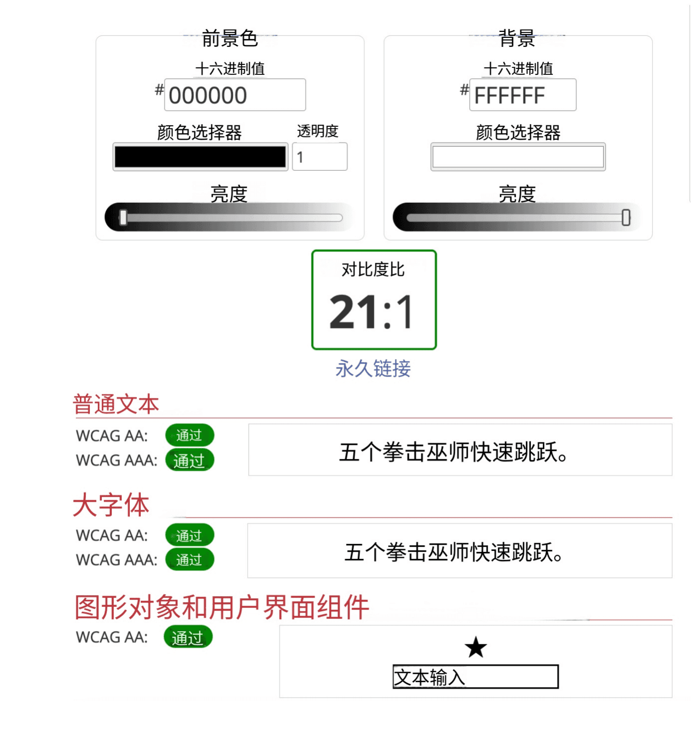
The example below uses 000000, black, as the foreground color and FFFFFF, white, as the background. The contrast ratio is 21:1, which satisfies WCAG Level AA and AAA.
Conclusion
In summary, prioritizing color contrast benefits many users, including people with low vision, people with color-vision deficiencies, and people viewing screens in dim conditions or under glare. Color contrast is not only about complying with accessibility guidelines; it is about creating a more inclusive digital environment.