
Establishing typography for a new project is always complicated. Hundreds of variables can be adjusted, and it is easy to spend enormous amounts of time changing type size, line height, margins, and weight. The best way to avoid collapse is to use a design system that answers most small questions quickly and leaves you free to concentrate on larger decisions.
Because readers spend far more time with body copy than with any other text size, the first major typographic decision is usually the default body-text size for the base layout, leaving responsive design aside for the moment. For many years, 16 pixels was regarded as the standard default for the web.
As screens have grown, however, text-heavy websites such as blogs and news services often use body sizes between 18 and 21 pixels. Social media and ecommerce applications, with more complex modular interface units, tend to use body sizes between 14 and 16 pixels. These are general tendencies rather than absolute rules, but the following list demonstrates the pattern.
Key Takeaways
-
The Importance of a Design System: Establishing typography for a new project is complex and time-consuming because it involves many variables. A design system can resolve common design questions quickly, simplifying the process and allowing designers to focus on broader, more influential decisions.
-
Choosing Body-Text Size and a Type Scale: Selecting the body-text size is a critical early typographic decision. Current trends favor slightly larger sizes for text-heavy websites and smaller sizes where interfaces contain many controls. A type scale, sometimes called a modular scale, applies a mathematical ratio to maintain harmony and consistency among sizes, making typography more systematic and coordinated.
-
Implementing Vertical Rhythm and Responsive Scaling: Vertical baseline rhythm creates a structured grid for aligning typography and strengthening visual harmony. CSS media queries should also adjust the scale for different device sizes so readability and visual quality remain strong across platforms. Tools such as Type-scale.com, Gridlover.net, and Archetype provide practical ways to experiment with and implement these principles.
Typical Body-Text Sizes on Well-Known Websites
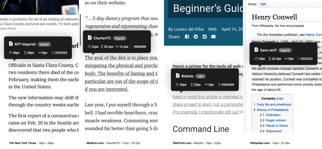
Examples from The New York Times, Medium.com, SitePoint.com, and Wikipedia.com
-
Medium.com:
21px -
The New York Times:
18px -
CNN.com:
18px -
Airbnb.com:
18px -
SitePoint.com:
18px -
BBC.co.uk:
16px -
Developer.mozilla.org:
16px -
Twitter.com:
15px -
Etsy.com:
14px -
Wikipedia.com:
14px -
Facebook.com:
14px
Remember that these major internet platforms conduct extensive user testing. Consider carefully how your application relates to their findings. Once you have selected a base text size, test it visually on real monitors, tablets, and phones until the initial result feels right.
Scaling Your Type
Now that the body size is established, how should you determine the sizes of headings, section titles, subheadings, lists, and block quotations?
My previous answer was usually, “Well… adjust it until it looks… about right?” I would enlarge a heading, make it slightly heavier, move it up one pixel, then down, then up again. Frankly, it was exhausting because there were countless subtle adjustments and very few answers that were obviously wrong.
Type scaling—sometimes called a modular scale—uses simple mathematics to produce a simple typographic solution. One ratio generates every type size while keeping the sizes harmonious, much like a musical scale for typography.
A Type Scale in Practice
Begin by setting the body-text size to 18px. The default paragraph size, 1em—or 18px—is then established.
body{font-size: 18px;}
p   {font-size: 1em; /* (or 18px) */ }
I will use a scale ratio of 1.25. To calculate the h5 size, multiply the paragraph size by 1.25. That produces 1em * 1.25, or 1.25em:
h5 = p * 1.25 = 1.25emThe h4 size is the h5 size multiplied by 1.25. Continuing the process produces the following:1.25em * 1.251.563em
/* Using a type scale of 1.25 */
h5 {font-size: 1.25em;}  /* 22.50px */
h4 {font-size: 1.563em;} /* 28.13px */
h3 {font-size: 1.953em;} /* 35.16px */
h2 {font-size: 2.441em;} /* 43.95px */
h1 {font-size: 3.052em;} /* 54.93px */
If the h1 feels too large at this ratio, reduce the scale to 1.2 and obtain the following:
h5 {font-size: 1.2em;}   /* 21.60px */
h4 {font-size: 1.44em;}  /* 25.92px */
h3 {font-size: 1.728em;} /* 31.10px */
h2 {font-size: 2.074em;} /* 37.32px */
h1 {font-size: 2.488em;} /* 44.79px */
Does this mean you need a pocket calculator every time you adjust the typography? Fortunately, no. Excellent tools let you modify and test type-scale ratios in real time and generate the corresponding CSS. My favorite is Type-scale.com by Jeremy Church. It allows rapid experimentation with different scales and produces usable CSS. The panel on the right even includes a sample layout and a CodePen export option. It provides a strong foundation for typographic CSS.
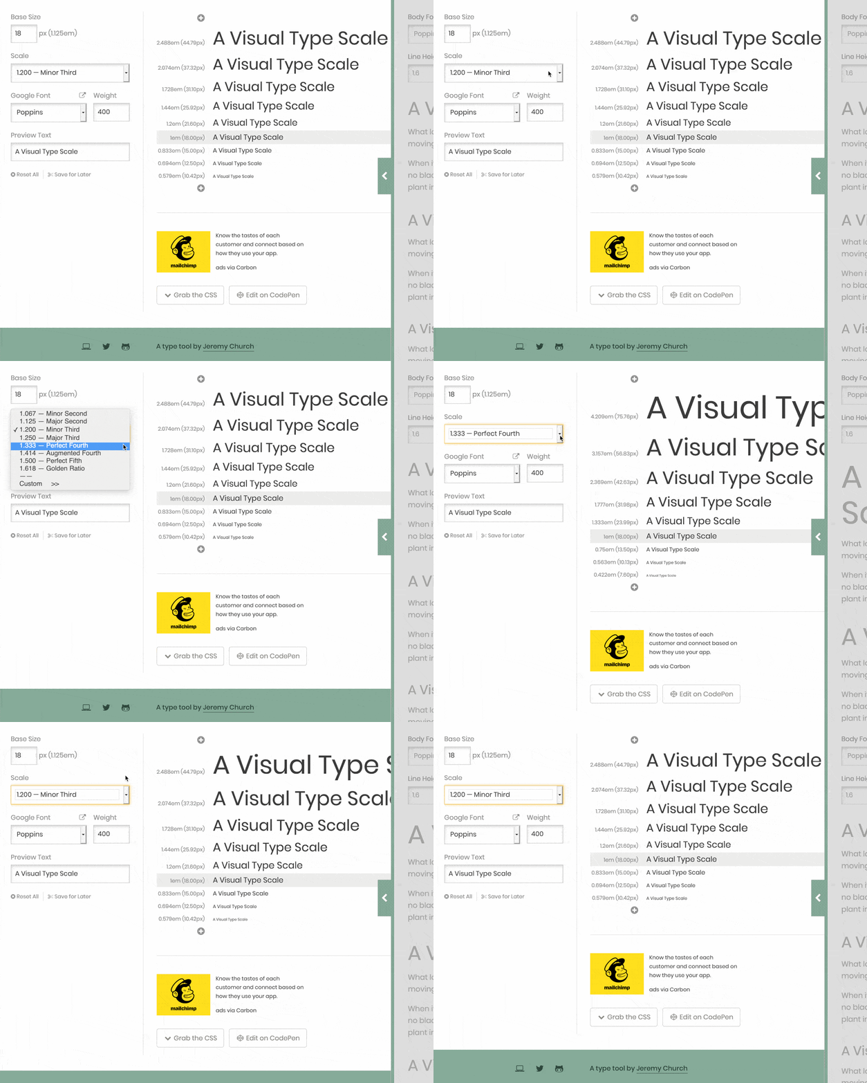
Type-scale.com generates a proportionally consistent set of type sizes.
Does One Type Scale Work for Every Device Size?
Usually not. Traditional print formats provide a useful lesson. Compare the typography of an ordinary newspaper with that of a classic paperback novel. Beyond the obvious difference in page dimensions, several interesting distinctions appear.
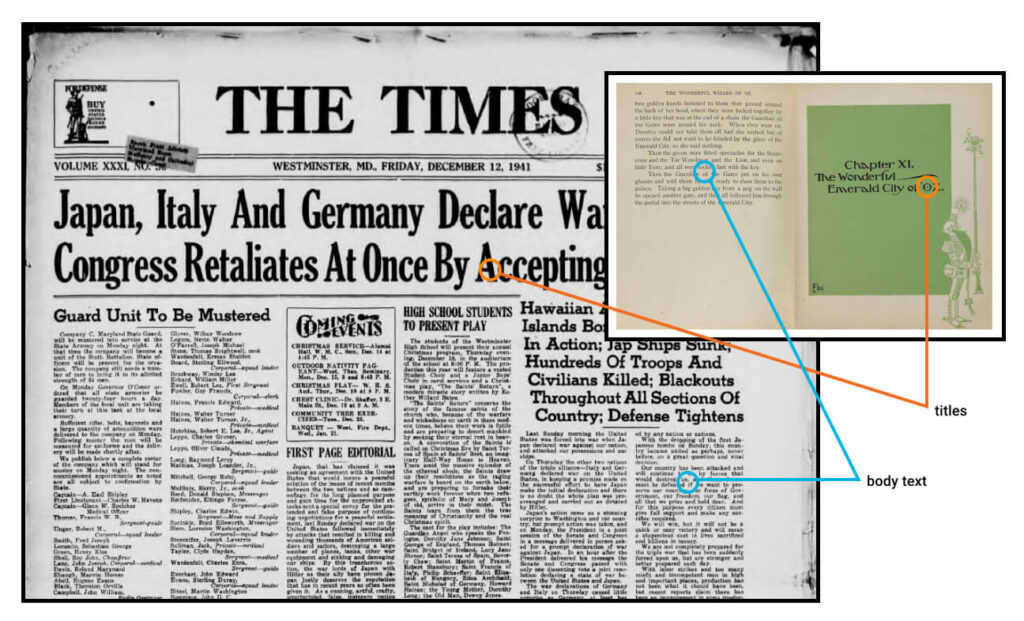
The Times uses a steeper type-size ratio than The Wizard of Oz.
Although the body text may be similar in size, the headings differ dramatically. Common sense tells us that the headlines in The Times would not work as chapter titles in The Wizard of Oz. Smaller formats, such as phones and novels, generally need a gentler scale.
Type Scales: Tiny Increases Accumulate into Large Differences
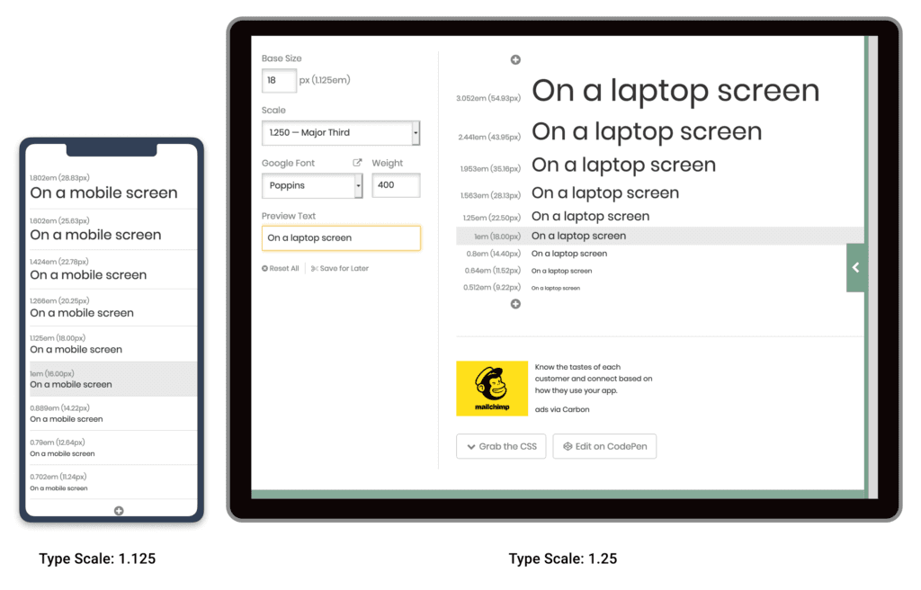
Notice that the ratio does not need to change substantially. As the illustration above shows, moving from 1.125 to 1.25 creates a cascading effect that ultimately generates a much larger top-level heading. An h1 that looks appropriate on a laptop may consume too much space on a phone.
In short, use CSS @media queries to provide two scales: a larger ratio for large screens and a smaller ratio for small screens. We will return to this later in the project.
Now that we have a reliable, repeatable process for scaling type, let us examine the whitespace between typographic elements.
What Is Vertical Baseline Rhythm?
Vertical baseline rhythm—sometimes called vertical measure—is a grid of horizontal lines from which you can “hang” your typography. It resembles the blue-lined exercise books many of us used when learning to write.
The challenge is aligning larger typographic elements with body copy on the same grid. In the simple handwritten letter shown below, E. G. Webb leaves an additional line for the signature. He may have been using a form of baseline rhythm without knowing its name.
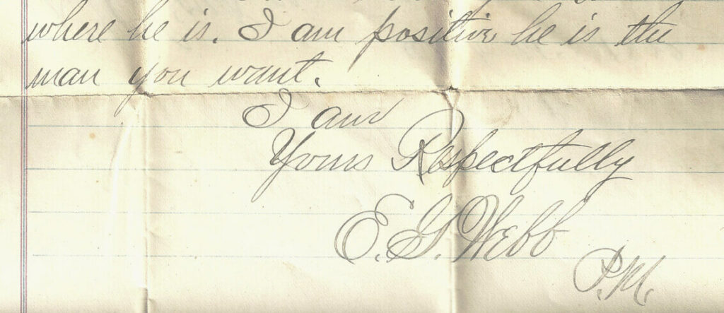
This elegant piece of vintage handwriting contains an inherent baseline.
In The Elements of Typographic Style Applied to the Web, Richard Rutter describes baseline rhythm as follows:
Headings, subheads, block quotations, footnotes, illustrations, captions, and other intrusions create syncopations and variations against the rhythm of regularly spaced lines. These variations can and should add vitality to the page, but after each variation the body text should return precisely to the beat and phase.
How does this work on the web? Consider a real example. The excellent Colossal magazine uses an open, airy layout that still feels stable and organized. How? Overlay a 21px vertical grid across the layout, as shown below, and a previously hidden structure becomes visible. In this example, I call one line of the grid a “unit.”
You will notice that:
-
The site branding fits perfectly inside a box five units high.
-
The primary navigation is three units high.
-
The article title is two units high.
-
The secondary navigation and social links are one unit high.
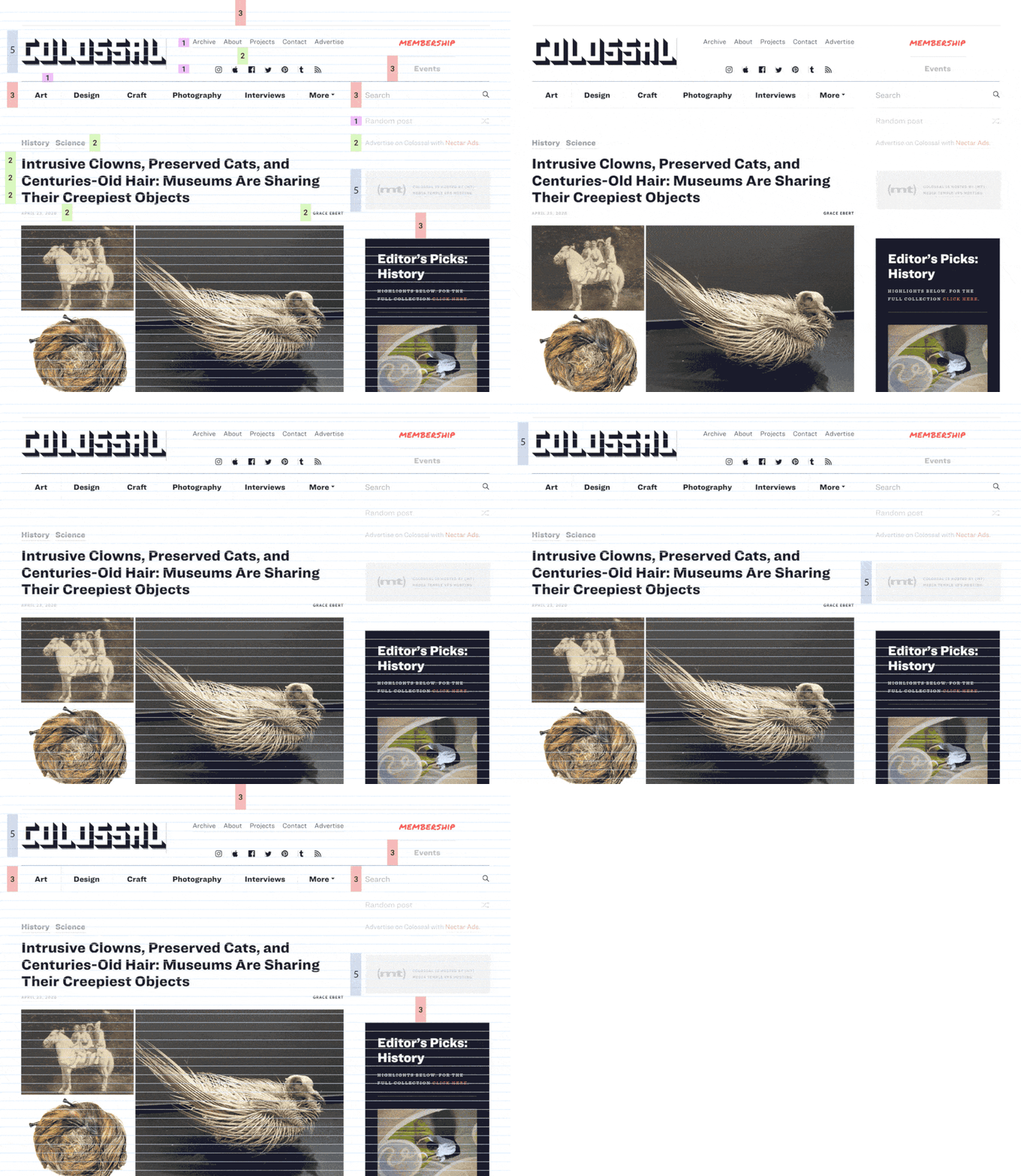
The outstanding art and design magazine This Is Colossal.
Most interface elements “hang” from this underlying grid like socks on an invisible clothesline. Even when the grid itself is unseen, its presence is felt through balance and harmony. Everything sits where it should.
We are not discussing type size alone, but the complete space occupied by the text—including line height and margins. In the Colossal example, the article title uses a line height of 42px, or two units per line.
You will also notice that not every element is locked to the grid. The designer offsets elements such as photographs, and that is perfectly acceptable. A grid is a strong starting point, not martial law.
Using Layout Grids in UI Design
Most modern graphic-layout tools, including Sketch, Figma, and Adobe XD, make it easy to add a vertical baseline to any canvas or frame. In the Figma example below, I selected the document frame and used the “+” button in the Layout Grid panel to add separate rows and columns.
Grid layers can be turned on and off with the eye icon. I find that enabling the grid and snapping to it makes resizing elements easier than working without one. It reduces effort.
A tool can even calculate the CSS for you. Gridlover.net is an excellent free utility for experimenting with base type size, line height, and type scale, all tied to a vertical baseline. If you adjust a line height or margin in the CSS panel on the right, the value changes only in complete grid units.
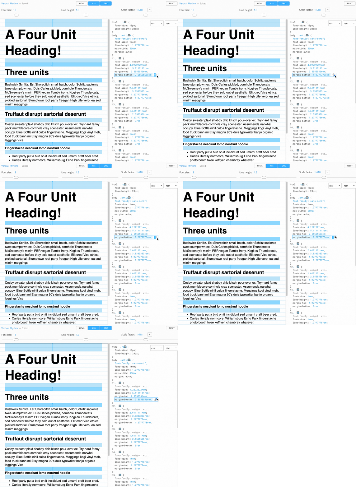
Gridlover.net: an excellent tool for generating vertical baseline rhythm.
You may notice that the generated typography avoids CSS padding. This is generally a good practice in vertical-baseline systems. Container elements can use padding freely, but typography itself should not. Even a text button can receive its height through line height rather than CSS height or padding.
Gridlover not only writes useful CSS, but also helped me understand how vertical baselines and type scales work in practice. It is an excellent starting point for learning CSS typography.
Archetype is another tool designed to help create a carefully considered, integrated typographic system. Its polished interface provides controls for type scale and baseline rhythm simultaneously. It even encourages separate scales for mobile and desktop from the beginning. I consider it the most advanced tool in this area.
Archetype’s only significant drawback is that exporting to CSS currently requires a $59 annual subscription. That is more expensive than the free Gridlover, but it can save substantial time and money if you build typographic systems frequently. Archetype is extremely good.
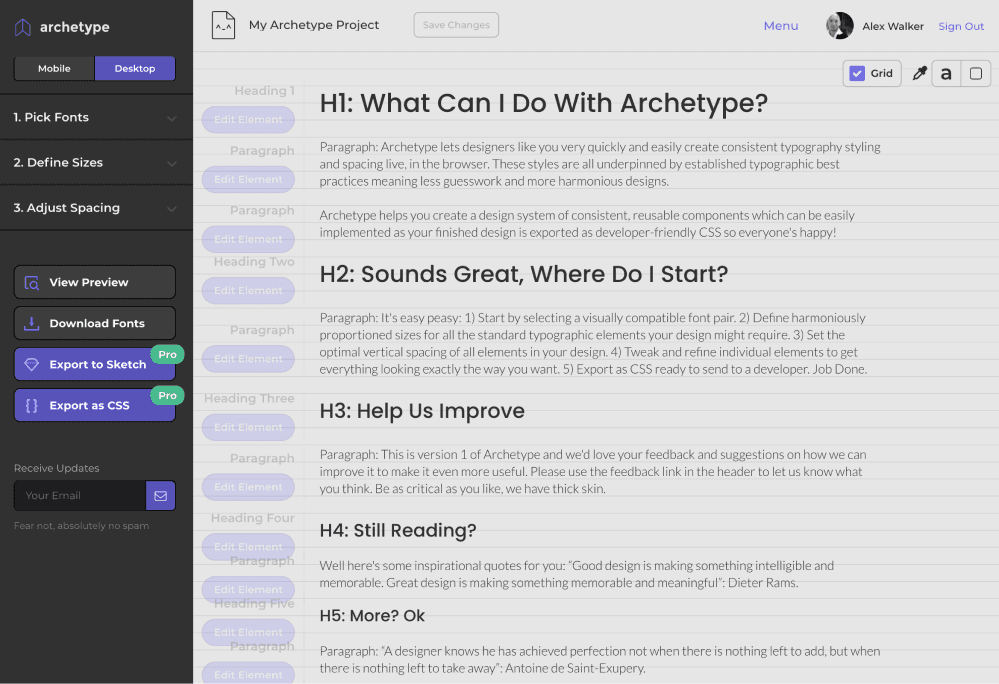
Archetype: a professional tool for designing typographic systems.
Vertical Baseline Rhythm Is a Tool, Not a Religion
A vertical baseline is highly useful, but it should not become the final objective of the design. I must admit that I once spent enormous effort forcing every page element to obey my rigid grid rules. I adjusted typographic ratios and margins obsessively until “fitting the grid” became the objective rather than a tool for creating a better design.
That was neither enjoyable nor useful.
Today I prefer to think of the vertical baseline as a strong bass drum in a band: a regular beat that helps every other musician understand the available space. Establish a clear backbeat that everyone can feel, but do not be afraid to add a small amount of syncopation. Those variations often give a composition—visual or musical—energy and character.
I personally prefer to begin with a clear grid. If there is whitespace between a heading and a paragraph, use one, two, or three complete vertical units rather than 1.3 or 2.75 units. The result feels more balanced and harmonious.
Similarly, it is preferable for a hero image to be exactly 12 units high rather than 11.8 or 12.3 units, because the lower edge of the image is then more likely to align perfectly with the lower edge of adjacent text. The layout gains a form of “automatic organization.”
On the other hand, if a caption looks too loose at a 25-pixel line height, ignore the grid. Make it look right.
Key Takeaways
Ultimately, most design work consists of a long list of answers to the question “why?”
-
Why is the primary heading 49 pixels high?
-
Why is the bottom margin 17 pixels?
-
Why does the
h3use a line height of1.7778?
And so on.
Even a small project may contain hundreds of these minor questions. You may have enough designer’s intuition to answer all of them eventually. The problem is that doing so is exhausting.
If you can establish a reusable system that supplies reasonable answers to most tedious small questions, you can reserve your design judgment for larger and more important decisions.
Those are usually the most interesting ones.