“Flat design” has been the default and dominant design style for more than a decade—and not by accident. After the glossy surfaces and heavy shadows of the Web 2.0 era, we needed design elements that remained clear and legible in a new world of responsive layouts.
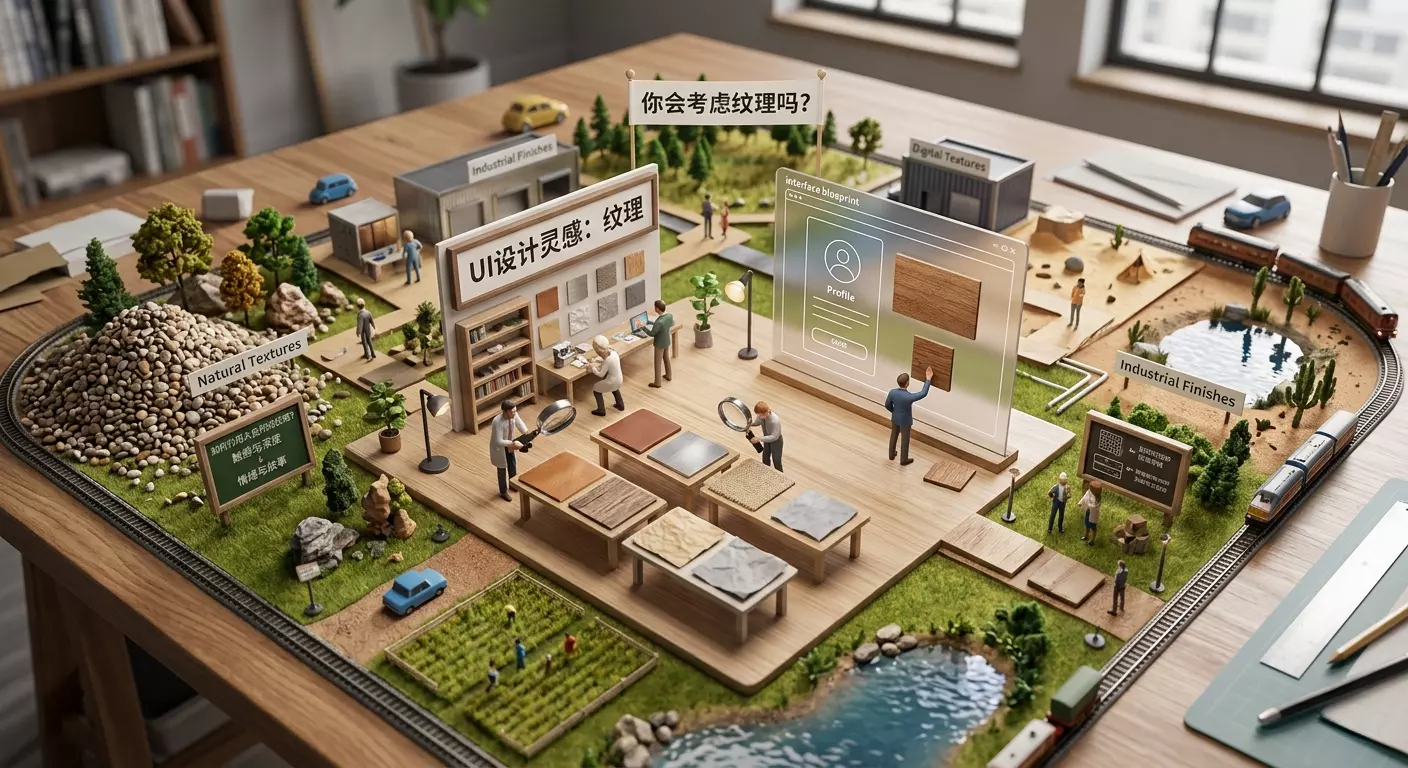
Yet flat color can easily make every interface look the same. Instead of adding another color or typeface, consider introducing texture. It can sometimes bring an entire UI design back to life. Let us look at several strong examples.
Key Takeaways
-
Texture can add depth and variety to user-interface design and prevent it from feeling excessively flat or generic. Subtle textures, such as the paper grain used in Google’s “A–Z of AI” project, can strengthen a design without demanding conscious attention from users.
-
Textures from traditional media, including paint and pencil, are especially striking in digital design because of their natural and tactile appearance. Applying them can be complex, however, as demonstrated by New Zealand design company Resn’s recreation of traditional Chinese watercolor for an Airbnb campaign.
-
Retro textures can evoke nostalgia and familiarity. Hypebeast used glowing television scan lines in its design, recalling 1980s arcade games and creating a distinctive vintage atmosphere.
-
Halftones and Ben-Day dots can give designs a rough, pointillist appearance. Originally a by-product of printing processes, the technique can add depth and texture to flat-color illustration, as demonstrated by the website of Misato in Shimane Prefecture, Japan.
Adding Paper Grain
In 2019, Google released a polished side project called “A–Z of AI” to explain fundamental artificial-intelligence concepts. Its style is modern and approachable, combining broad areas of flat color, simple children’s-book illustrations, and bold, expressive serif typography.
Look closely at the flat-color areas, however, and you will notice paper-like grain. I enlarged a small section in the image below, though you may need to view the original to appreciate it fully. The effect is so subtle that most users probably never notice it consciously, yet it fits the simple children’s-book aesthetic perfectly.
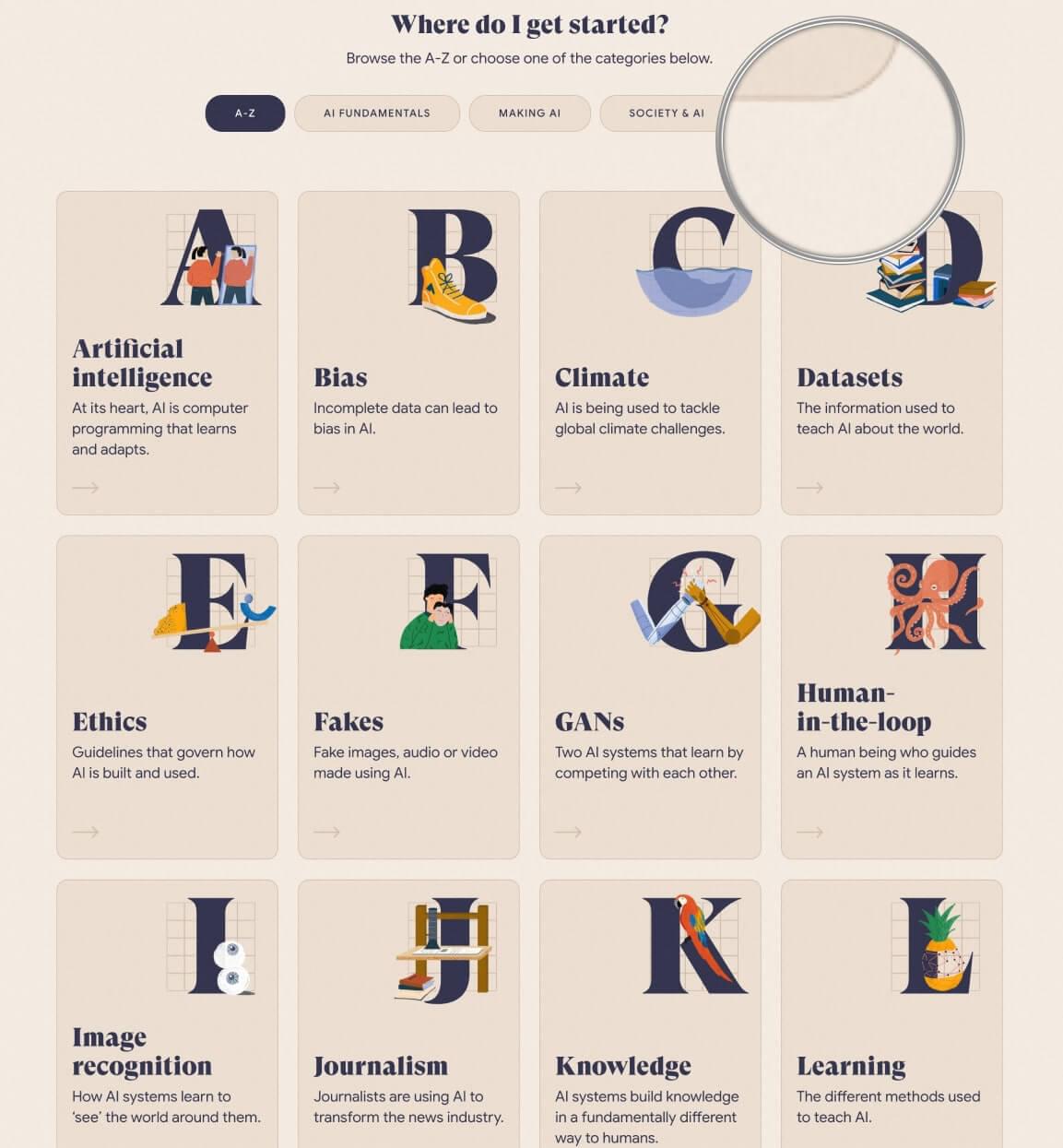
The designers of Google’s A–Z of AI introduced warmth and tactility into an otherwise flat design.
So how did they create the effect?
I must admit that I spent a considerable amount of time examining the background-image CSS property on every large flat panel, looking for a tiled graphic—but found nothing. It was genuinely puzzling.
The answer occurred to me the following day. What if they had not added grain to every panel, but instead created a nearly invisible “grain-filter layer” across the entire site? Think of it as a Snapchat grain filter.
Found it. I had been looking in the wrong place.
Inspect the HTML and you will find an :after pseudo-element with the following CSS:
._3rV4LQ0BePEq9V1dxEjhEF::after {
    background: url(/static/noise.jpg);
    content: "";
    height: 100%;
    left: 0;
    opacity: .05;
    pointer-events: none;
    position: absolute;
    top: 0;
    width: 100%;
    z-index: 201;
}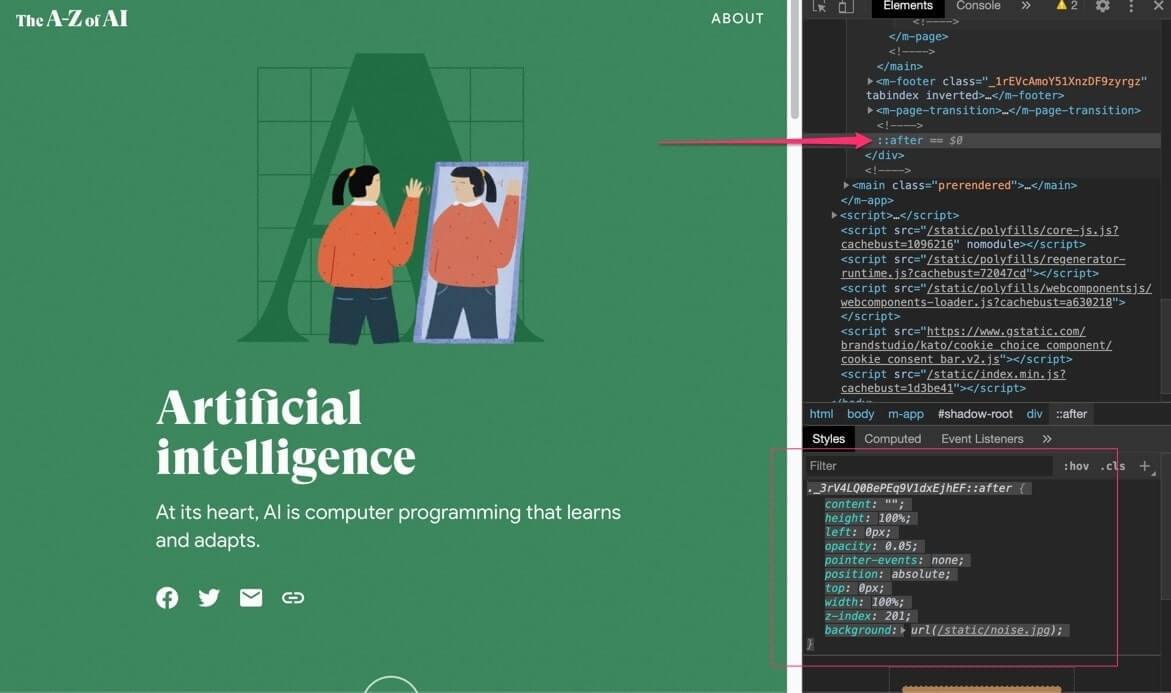
The :after pseudo-element creates a nearly transparent texture layer.
The layer uses a grain image (noise.jpg) as a tiled background and positions it to cover the entire screen using width:100% and height: 100%top:0left:0z-index:201
. As expected, the opacity is set to almost transparent (opacity: .05), leaving only a faint grain. The one potential problem with placing this “lens layer” over the screen—even when transparent—is that it could block the pointer from reaching links, inputs, and other interactive elements underneath.
Fortunately, the solution is simple: add pointer-events: none so the lens layer becomes invisible to the user’s pointer.
I think this is an extremely practical technique. A tiny image and roughly a dozen lines of CSS can create a dramatic effect across an entire website. The return on effort is excellent.
Paint, Pencil, and Other Traditional Media
Computers are designed for precision and cleanliness. Unlike most traditional media, digital color does not accidentally bleed, smudge, seep, or blur. That is useful for keeping the desktop tidy, but it also means that genuine, natural, and organic materials such as paint and pencil can stand out powerfully when used in the right context.
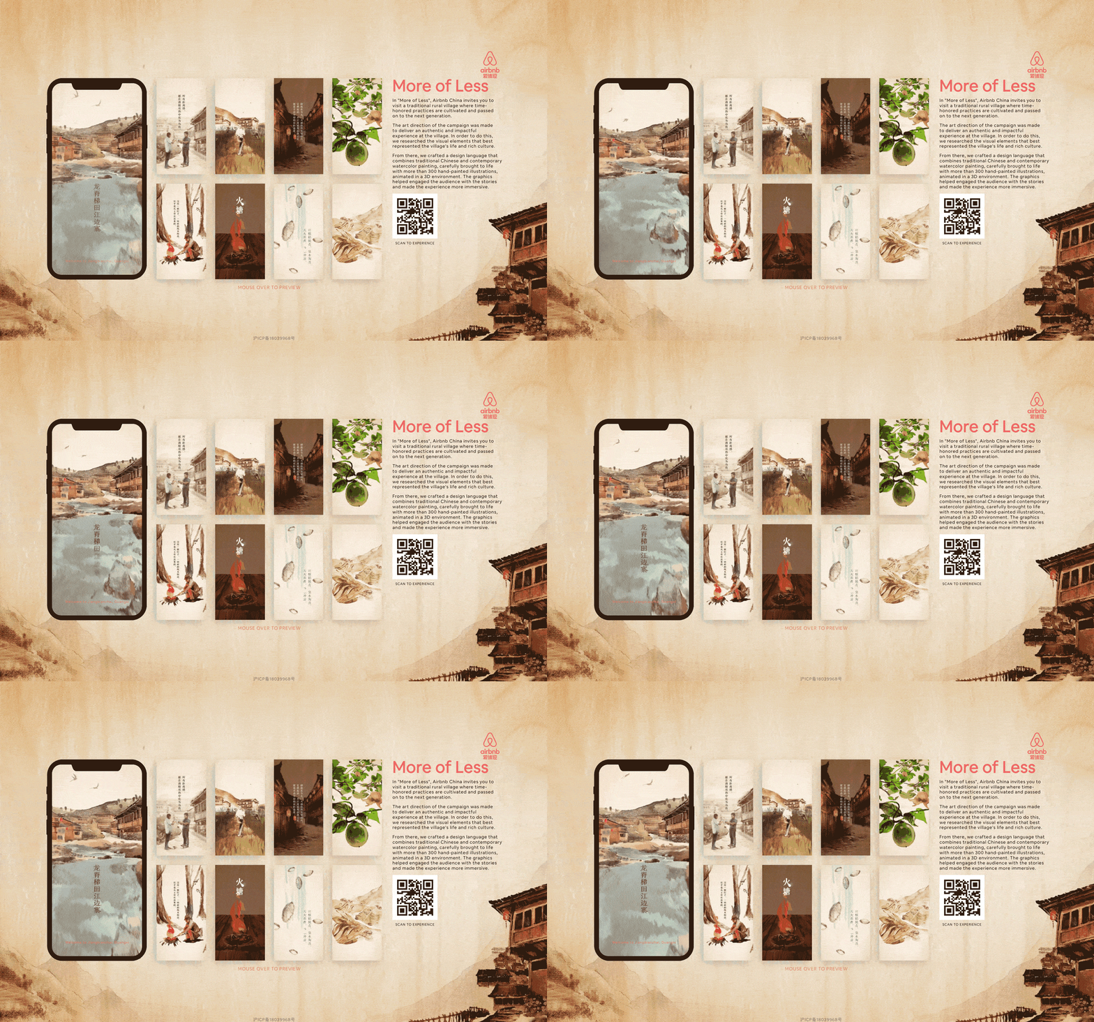
Airbnb China’s “Less Is More” campaign brought Chinese watercolor into the digital world.
Although the application mentioned above is no longer active, New Zealand agency Resn provides a strong recent example by authentically reproducing traditional Chinese watercolor to promote rural Airbnb experiences in China.
The watercolor style permeates every pixel of the application, from push-pull animation sequences to full-screen backgrounds, making it a substantial production effort.
Faded Memories
When Obys Agency created a digital tribute to Formula One champion Niki Lauda, its approach drew heavily from the extensive archive of remarkable photographs and video documenting his career.
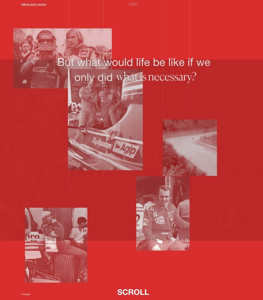
Obys pays tribute to Niki Lauda.
The grainy, reddish-brown photographs give the site a warm, gently nostalgic atmosphere. It is easy to overcommit to a vintage theme and end up imitating an old book or newspaper. Encouragingly, Obys avoids that cliché by presenting archival imagery in a dynamic web layout that would be impossible in a traditional book.
Digital Retro
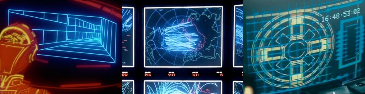
Retro references: Tron (1982), WarGames (1983), and Blade Runner (1982).
“Retro” is never a single point in time but a point of view, as Hypebeast demonstrates through work deeply influenced by the 1980s. Its rotating vortexes, two-tone lines, and shimmering scan lines recall the light cycles of Tron, the command center in WarGames, and Blade Runner.
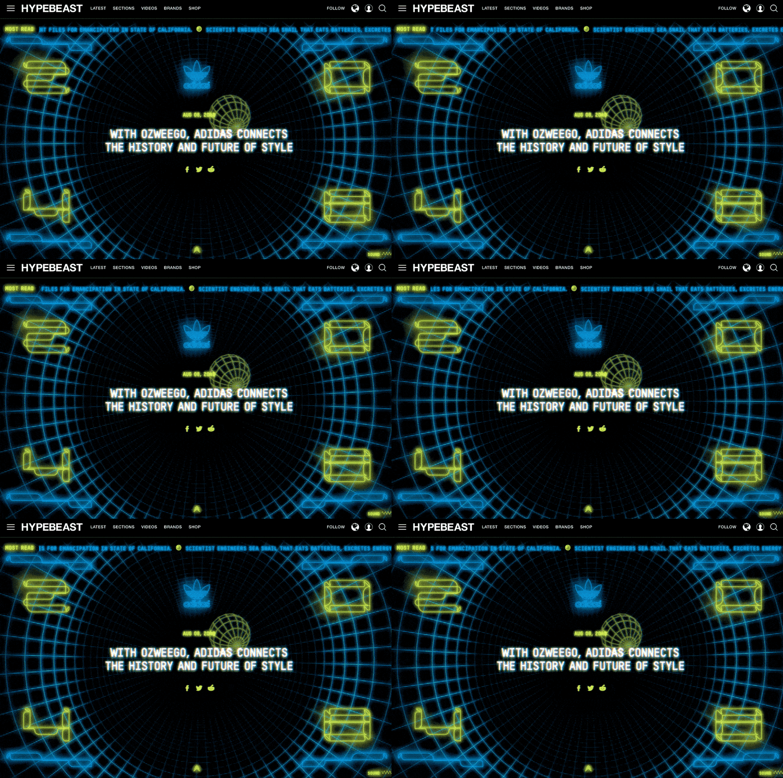
Hypebeast incorporates a substantial amount of 1982 into its music and streetwear aesthetic.
Although Hypebeast uses an HTML5 canvas to render its animation, the glowing television-scan-line effect would also suit the lens-layer technique discussed earlier in this chapter.
Halftones and Ben-Day Dots
If you have ever examined an old comic book, newspaper, or magazine closely, you may have noticed the dot patterns used to create tonal variation in images.
Technically, printing uses two types of dot pattern. A halftone screen employs a plastic grid of tiny lenses to expose black dots onto photosensitive film beneath it. The stronger the light, the larger the dot.
The first panel in the image below shows a halftone sample from an Andy Warhol mural created in 1964.
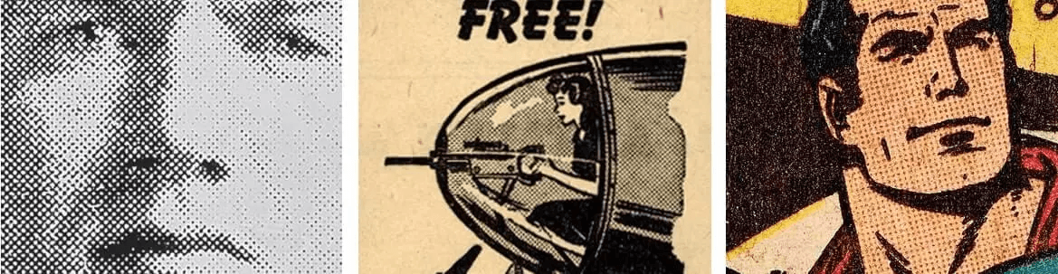
Halftone and Ben-Day dot patterns appear in Warhol’s Pop Art, newspaper advertisements, and comics.
Ben-Day dots work slightly differently. Comics—such as the Superman example above—were commonly outlined in black, then overlaid with evenly sized Ben-Day dots to simulate additional ink colors. A field of small red dots printed on white paper produced pink inexpensively.
Although the rough, dotted appearance of these techniques began as an unavoidable by-product of printing, it eventually became an artistic language in its own right—and remains one today.
Misato in Shimane Prefecture, Japan, is one of my favorite recent examples of this technique. Its website takes the form of an illustrated map that users can explore virtually. The illustrations are lively and playful, using mostly flat colors with carefully applied halftones that add depth and texture.
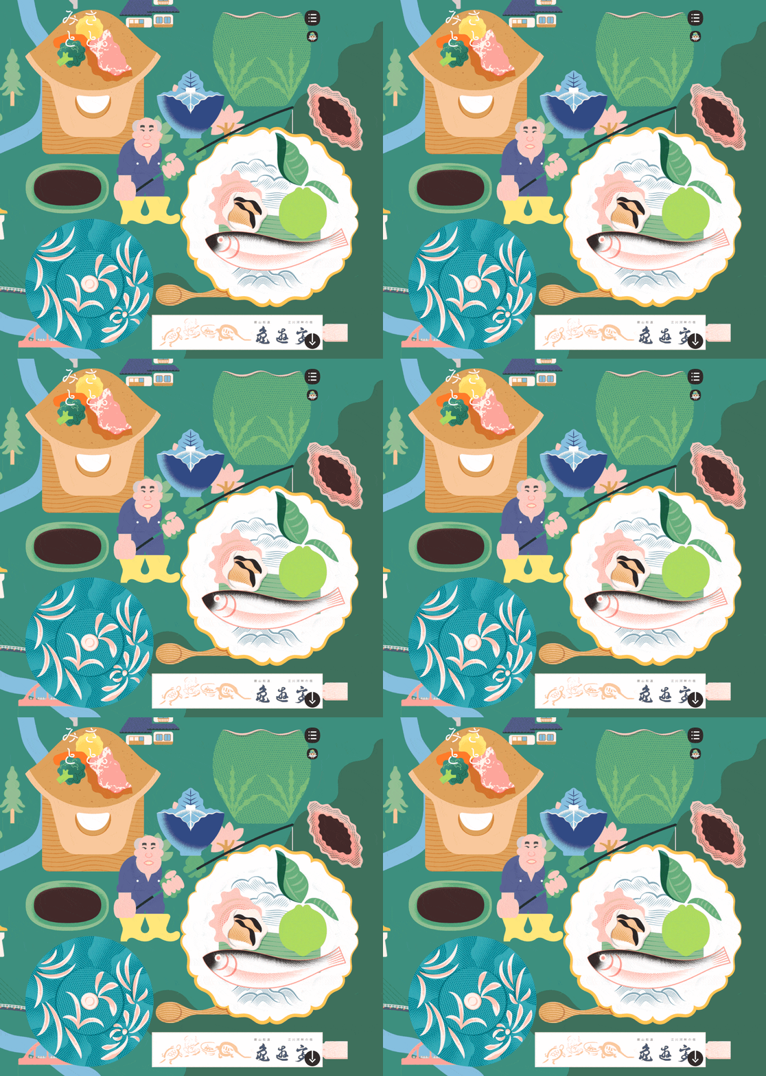
Shimane Misato uses coarse halftones to give flat-color illustrations depth and impact.
DIY Halftones
Many Photoshop filters can simulate a halftone effect. They are acceptable, but if we are deliberately removing photographic detail by converting an image into halftone, it makes more sense to convert the result into vector graphics—ideally SVG. For that purpose, I am happy to recommend HalftonePro.
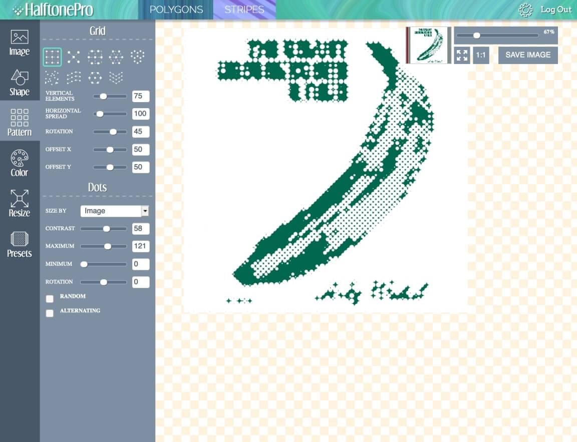
HalftonePro can convert almost any bitmap into SVG with relatively little effort.
HalftonePro allows you to upload any bitmap and apply a range of halftone settings, including:
-
Grid scale
-
Grid pattern: circles, squares, triangles, and more
-
Dot shape: circular, square, triangular, and more
-
Contrast
-
Color output
Here are several tips for creating high-quality SVG halftone images:
-
Not every image suits this style. Bold, high-contrast images generally work best.
-
An extremely fine grid can create files that are very large and difficult to manage. Embrace the roughness.
-
Begin with presets to learn which combinations work.
-
Use a tool such as Jake Archibald’s SVG Optimizer to reduce file size.
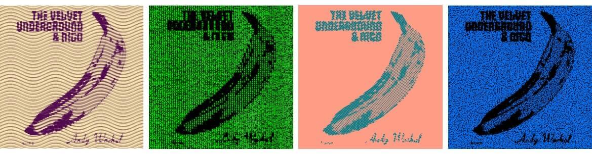
Four different halftone treatments of Andy Warhol’s Velvet Underground cover.
Note that HalftonePro is not free. It currently costs $15, but that is a one-time payment for lifetime access—a welcome rarity in a world dominated by monthly and annual subscriptions. I paid for it and still consider it good value.
Hidden Grain
Perhaps the most ingenious recent use of texture I have seen is on the Harvard Film Archive website. Open the site and you may wonder, “What texture? This website looks completely flat.”
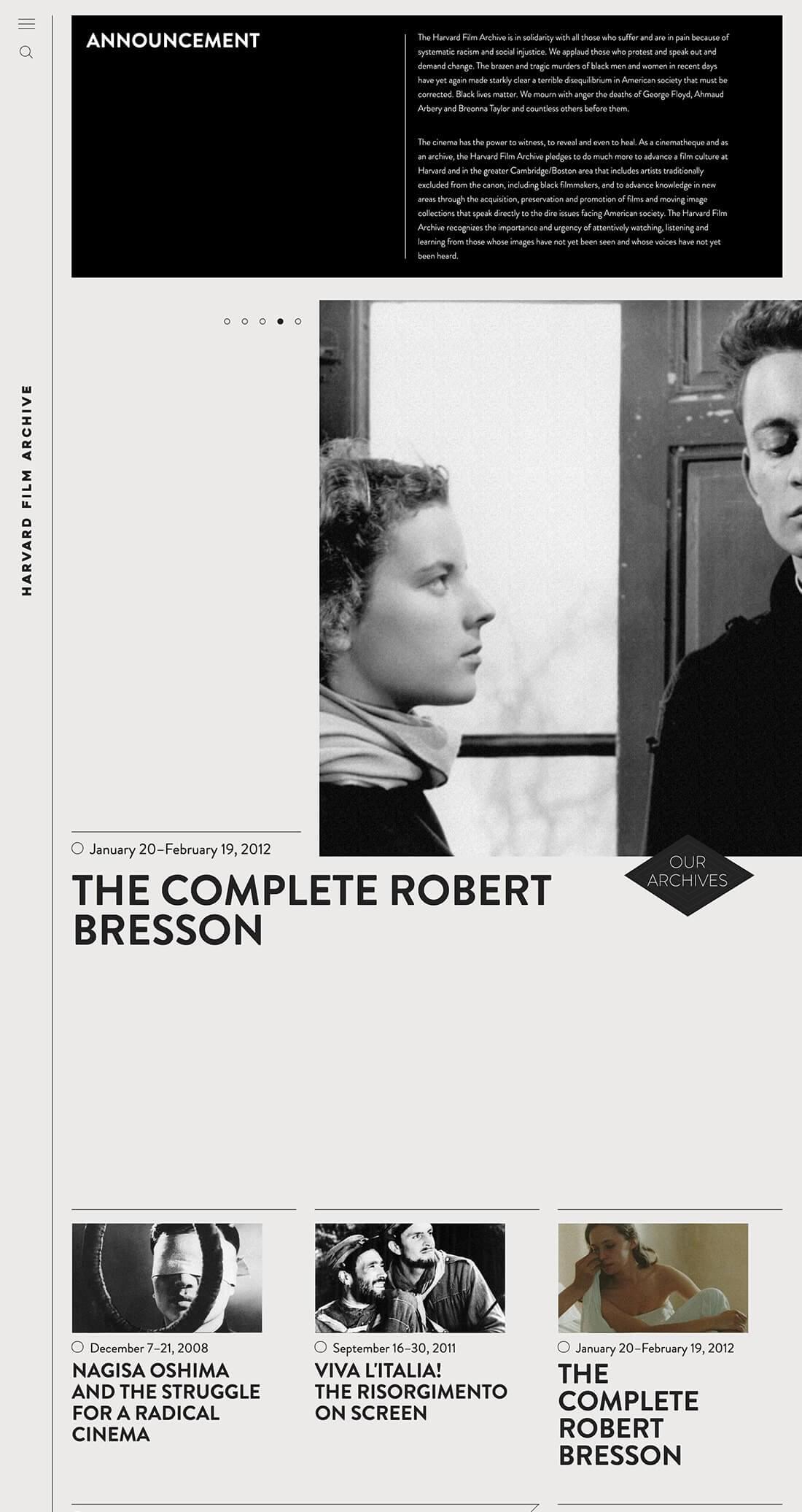
The Harvard Film Archive applies animated film grain to its images.
Look more closely at the images and you will notice a subtle energy similar to film flicker. The frontend designer added a delicate layer of animated film grain over every image. (On my phone, however, the effect was not present in the mobile view.) I suspect few users consciously notice it, but it gives the still photographs the feeling of film frames.
How did they do it?
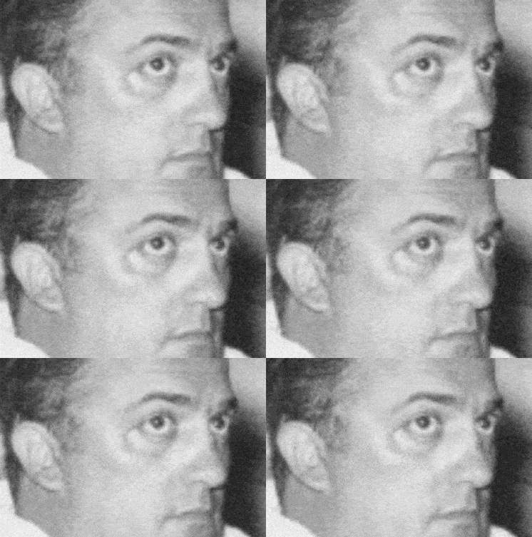
A close-up of the film-grain effect.
For readers interested in the technical details, the developer used JavaScript to create an HTML5 canvas layer over every image. Each canvas plays a nearly transparent animation of random noise. The idea is clever, but its complexity makes me appreciate the simplicity of Google’s paper-grain technique even more.
Leading with Texture
As we have seen, texture has a substantial effect on how people perceive a design. Following current web design trends is important when creating effective contemporary work, but understanding design patterns from before the internet will help you develop your own style and create more original results.
Ultimately, the image a client wants to establish and the communication objectives they define should determine how much texture you use and what kind.
Excerpted from The Principles of Beautiful Web Design, Fourth Edition.
Frequently Asked Questions About UI Design and Texture
Why is texture important in user-interface design?
Texture is an important element of UI design because it adds depth and detail to the overall experience. It can distinguish elements on a screen and make an interface easier to understand and operate. Texture can also establish a particular atmosphere or emotional tone. A rough texture, for example, may communicate an outdoors-oriented, rugged feeling, while a smooth texture can feel sleek and contemporary.
How can texture be used effectively in user-interface design?
To use texture effectively, consider the overall design aesthetic and the message you want to communicate. Texture should strengthen the design rather than distract from it. Usability is equally important. Excessive texture can make an interface difficult to operate, so finding the right balance matters. Test different treatments and determine which one best supports the design.
What common mistakes should be avoided when using texture in UI design?
Common mistakes include overusing texture, selecting textures that conflict with the overall aesthetic, and applying textures that make the interface difficult to navigate. The effect on loading time must also be considered. High-resolution textures can slow a page and negatively affect the user experience.
Can you provide examples of effective texture use in user-interface design?
There are many strong examples. A subtle wood grain used in a website background can create a warm and comfortable atmosphere. A rougher texture can establish a rugged outdoor feeling. The key is applying texture with restraint so it improves the visual result and the user experience.
Where can I find inspiration for using texture in user-interface design?
Many resources can provide inspiration. Websites such as Dribbble and CollectUI showcase a wide range of interface designs, many of which use texture creatively and effectively. The physical world is another source: observe textures in nature, architecture, fashion, and other fields.
What resources can help me find textures for UI design?
Many resources offer textures for user-interface work. Websites such as Textures.com provide a wide selection of high-quality files that can be downloaded and incorporated into designs. You can also create original textures with tools such as Photoshop.
How can I test whether the textures in my UI design are effective?
User testing can evaluate the effectiveness of texture in a UI design. Gather feedback about both usability and visual appeal. Analytics tools can also reveal how users interact with the design and provide insight into whether the texture supports or obstructs their behavior.
How can I learn more about using texture in user-interface design?
Many resources explain texture in interface design. Websites such as SitePoint offer articles and tutorials, while books and online UI-design courses often address texture as part of a broader visual system.
Does texture affect the loading time of my UI design?
Yes. High-resolution textures can increase loading time and negatively affect the experience. Textures should therefore be optimized carefully to ensure fast performance.
Can texture be used in both web and mobile UI design?
Yes, but the differences between the platforms must be considered. Mobile devices have smaller screens and often slower network connections, so texture should improve the design without damaging usability or loading performance.