Many people equate UI with “looking good.” From a product perspective, however, the ultimate objective of UI is to help users complete tasks faster, more accurately, and with less effort. No matter how beautiful an interface is, if it makes users hesitate for one more second, hides an entry point, or causes a single mistaken tap, it becomes an experience problem—and potentially a conversion problem.
1. Why an Attractive UI Is Not Necessarily Usable. Attractive interfaces are often filled with decorative elements, but what users actually need is clear hierarchy, obvious entry points, and consistent feedback. Many designs look “premium” while creating problems such as:
-
Insufficient contrast between headings and body text, making the primary information difficult to identify
-
Buttons that are too small or inconsistently placed, leaving users unsure where to click
-
Slow or excessive motion that makes users think the system has frozen
-
Ambiguous copy that does not explain what will happen next. The standard for usability is practical: fewer steps, fewer errors, and less thinking are required to complete the task.
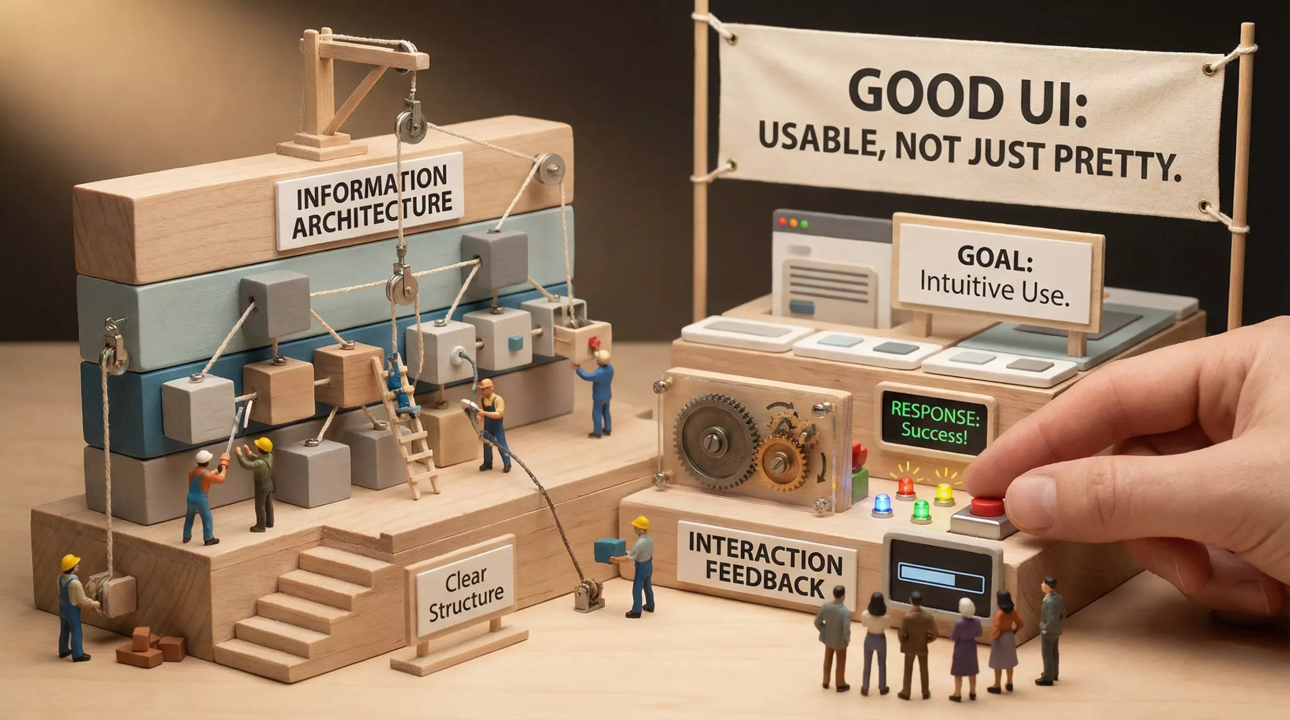
2. Information Architecture: Organize the Content Before Discussing Visuals. Information architecture determines whether users can find something immediately. A useful three-level structure is: 1) Core objective: what should users accomplish on this page? 2) Primary modules: which content groups support that objective? 3) Detailed content: what information appears in each group, and what should remain hidden? Your task is to make the content leaner and the information clearer, so the page behaves like an easy-to-navigate table of contents rather than a complicated poster.
3. Hierarchy and Alignment: Keep Important Information in Front. Hierarchical design is the skeleton of UI and includes:
-
Type scale: larger headings and smaller body text
-
Spacing hierarchy: more distance between modules and less distance within a module
-
Visual weight: use color and shadow only to emphasize important content
-
Alignment rules: consistent alignment lines dramatically reduce visual noise. Every alignment decision tells users that certain content belongs together and establishes the intended reading order.
4. Interaction Flows: Replace Free Roaming with the Shortest Path. If you want users to complete a task, do not force them to wander. Flow design should first protect the critical path:
-
Provide the entry point first: make the CTA prominent and its copy precise
-
Then divide the task into steps: break complex processes into manageable stages to reduce cognitive load
-
Allow important choices to be reversed, reducing loss aversion
-
Explain necessary information in advance because users dislike discovering rules only after making a mistake. The objective is simple: users should not need to guess; the system should guide them to the destination.
5. Feedback: Every Action Must Be Visible. Interfaces without feedback are dangerous because users cannot tell whether the system is working. Feedback generally includes:
-
Visual feedback: a pressed button or an upload progress bar
-
Textual feedback: confirmation of success or an explanation of failure
-
Motion feedback: appropriate transitions that help users understand sequence and timing. Strong feedback makes a product feel reliable and human.
6. Accessibility: Not an Extra Feature, but a Baseline. Accessibility is not only for a minority; it improves the experience for everyone. At minimum, you should:
-
Meet contrast standards and avoid gray text on gray backgrounds
-
Place clear form-error messages close to the relevant fields
-
Pair icons with text where possible and never communicate information through color alone
-
Support keyboard operation for critical actions and provide a logical focus order. These decisions directly affect completion rates and satisfaction.
7. Measurement: Use Data to Prove Usability. Usability is not an aesthetic judgment; it is measurable. Common indicators include:
-
Bounce rate, task-completion rate, and checkout conversion
-
Form-error rate and repeated-entry rate
-
Task time: how many seconds users need to complete a critical action. Reviewing these indicators turns usability from personal experience into a repeatable method.
Conclusion. Good UI is never a finished surface; it is a system composed of information architecture, hierarchy, flows, feedback, and accessibility. Do not let appearance obscure the real problem—users want the product to feel effortless. When you design around task objectives, design work becomes faster, communication costs fall, and results become more stable.