In recent years, a particular layout approach has become increasingly popular across social platforms and product design: Bento UI, or the bento-box layout.
Its central idea is simple:
Use a composable grid to divide information into multiple “cards,” then combine those cards through size, spacing, and hierarchy to create a clear, rhythmic overall structure.
For users, this layout is more intuitive and easier to scan.
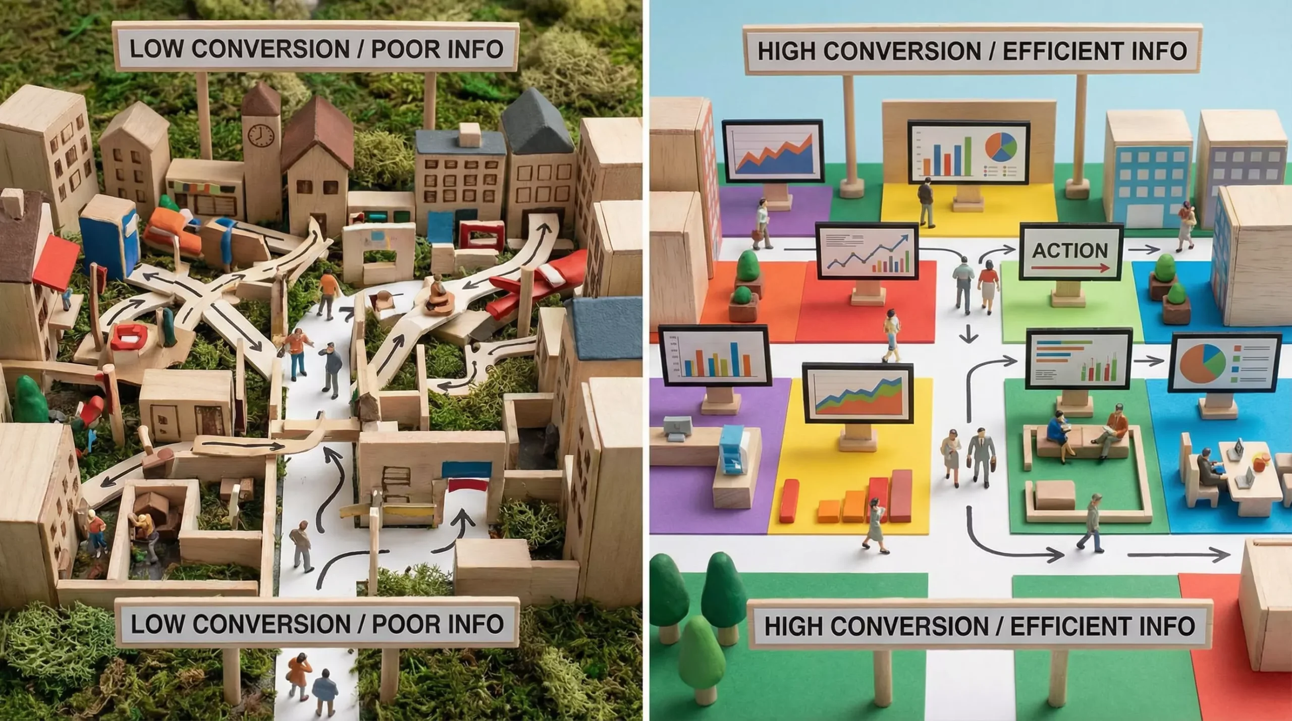
For business objectives, it communicates core information more efficiently, reduces the effort required to understand the page, and can therefore improve conversion.
I. Which Scenarios Are Best Suited to Bento UI?
Bento UI is not appropriate for every situation, but it performs particularly well in the following scenarios:
1. Concept-Driven Showcase Pages
For product-feature introductions, new-feature announcements, brand narratives, and similar content, card-based presentation helps users identify the main points quickly.
2. Tool and Function-Oriented Pages
These pages often have high information density. Traditional layouts built from large uninterrupted sections impose a greater cognitive burden, while Bento UI can divide the information and improve reading efficiency.
3. Administrative Systems
In interfaces containing substantial data, actions, and status information, a card-based structure makes content clearer and simplifies future expansion.
4. Component-Based Design Pages
When a page consists of many modules, Bento UI makes it easier to establish a unified structure and supports reuse across both design and development.
II. Its Essence Is Information Architecture, Not Visual Style
Many people treat Bento UI as a “design style,” but fundamentally it is a way of expressing information architecture.
Before designing each card, clarify three things:
-
What is this card’s single task?
-
What is its core information?
-
Does it genuinely belong in this position?
If these three questions cannot be answered clearly, the page is likely to become:
👉 Disorganized, poorly prioritized, and unclear about what matters.
III. Design the Grid Before Designing the Page
A common mistake is to begin drawing the complete page immediately when creating a Bento UI.
The correct approach is:
👉 Design the grid system first, then add the content.
Core Methods:
-
Define the base grid size, such as 240, 280, or 320 px
-
Design composable card sizes—small, medium, and large
-
Ensure that cards can be combined and rearranged
A strong grid is fundamentally a reusable structural system, not a one-time layout.
IV. The Narrative Logic of Bento UI
As the amount of information grows, the key to Bento UI is not visual styling but narrative structure.
Focus on three things:
1. Establish a Clear Reading Order
-
Top: core value or primary selling point
-
Middle: direct benefits or feature explanations
-
Bottom: supporting information
2. Create Clear Information Hierarchy
Differentiate cards through:
-
Background color
-
Shadows
-
Borders
-
Highlights
3. Limit the Number of “Special Cards”
Do not overuse emphasized cards, or the page will lose its focal point.
👉 Special cards must be few, precise, and essential.
V. Responsive Design Is the Real Challenge
Many designs look excellent on desktop but collapse on mobile.
When making Bento UI responsive, pay particular attention to the following:
-
Every card type needs a mobile-specific solution
-
Avoid compressing information excessively
-
Maintain a clear reading rhythm
CTAs, or key action buttons, must receive priority on mobile so they remain both visible and easy to operate.