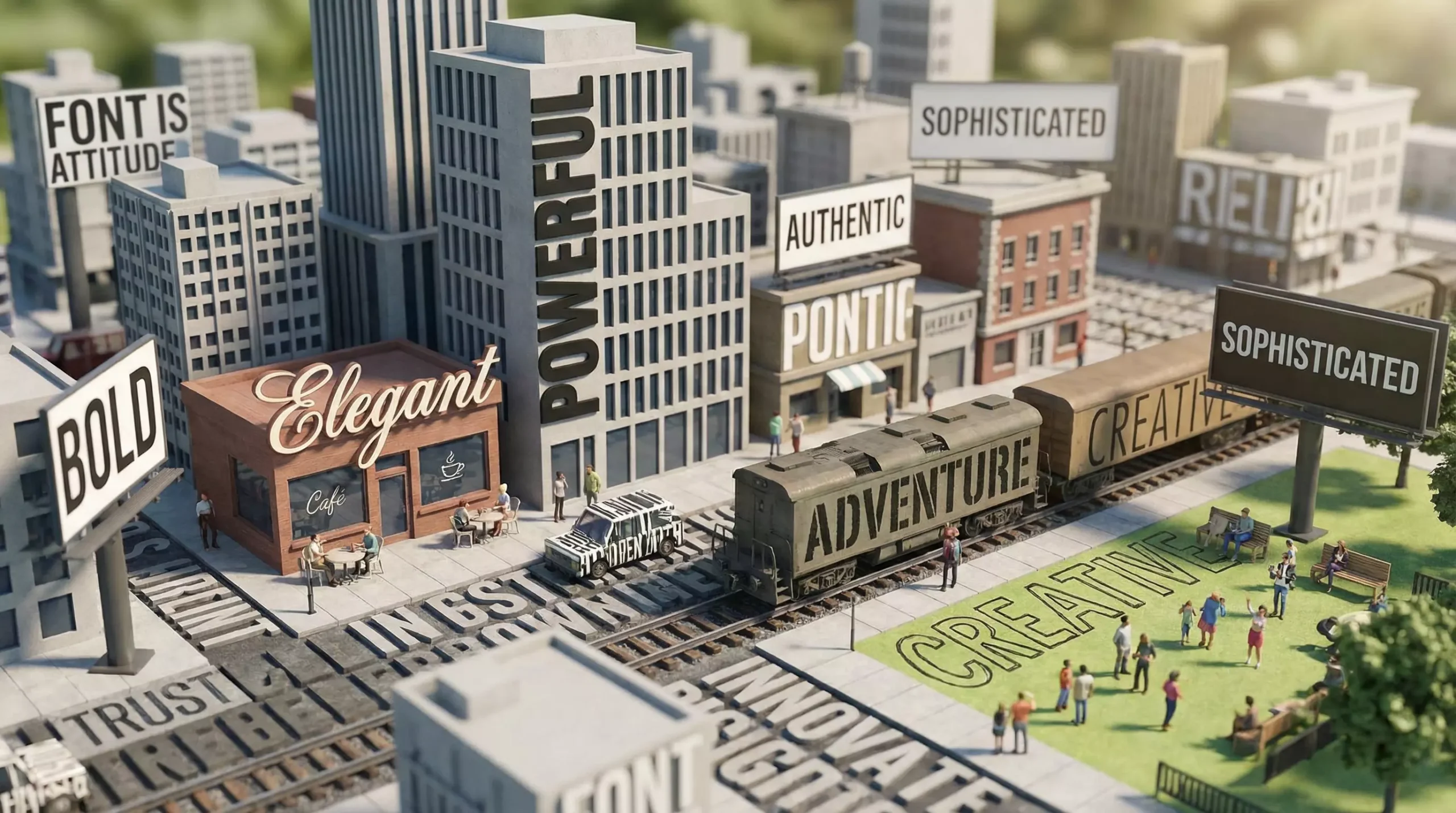
Typography is not decoration; typography is an attitude. The typeface you choose determines how users interpret you: serious or lighthearted, modern or classic. The role of typography is to turn information from “words” into “language,” and a page arrangement into a brand voice.
When a design fails to feel premium, the problem is often not the colors or the quality of the images, but a lack of rhythm: font sizes have no system, line spacing is cramped, alignment feels arbitrary, and list hierarchy does not reveal what matters. Once typography loses control, users abandon reading more quickly because the brain does not want to waste effort identifying the structure of information.
Principle One
Prioritize readability. Visual gimmicks expire, but readability never does. Body type does not need to be expensive; it only needs to be stable, clear, and consistent in its letterforms. Headings can use a more distinctive typeface to create contrast, but they should not compete with the content itself. The goal is to make the content readable, not merely visually interesting.
Principle Two
Create a reusable type scale. Choose a base size, such as 16, and use a ratio to establish the size relationships among H1, H2, H3, body text, captions, and buttons. Common ratios include 1.25 and 1.333. This allows design to rely on rules rather than intuition, and makes it easier for developers to define variables and reuse them across modules. The ability to scale is a fundamental quality of professional work.
Principle Three
Let whitespace become the design’s “breathing room.” Many teams try to fill every area with information because they assume empty space is wasted space. The result is a page with no tension. Whitespace is not emptiness. It creates emphasis, provides breathing room, and helps users read longer and understand faster.
Principle Four
Alignment is a form of respect. When headings, body text, images, and buttons have no alignment relationship, the page resembles a team with no shared understanding. A clean right edge can make a page feel more refined, while baseline alignment makes it feel more stable. Every alignment decision helps establish order for the brand.
Principle Five
Use as few typefaces as possible. Two are enough: one for content and one for emphasis. Emphasis should come from hierarchy rather than ornament—weight, size, color, and spacing. Many combinations that appear “distinctive” ultimately become noise and leave the brand without a clear personality.
The hardest part of typography is that it is almost impossible to explain in one sentence why it feels “premium.” You can only tell the team that strong typography makes users more willing to trust you; when users trust you more, conversion follows naturally. Design makes invisible qualities produce visible effects.
If you are anxious about making a page feel premium, remember this: sophistication comes from consistency and restraint, not from piling on effects. Doing less, but executing it with exceptional cleanliness, often makes the work far more persuasive.